Upgrade to bid, buy, and sell
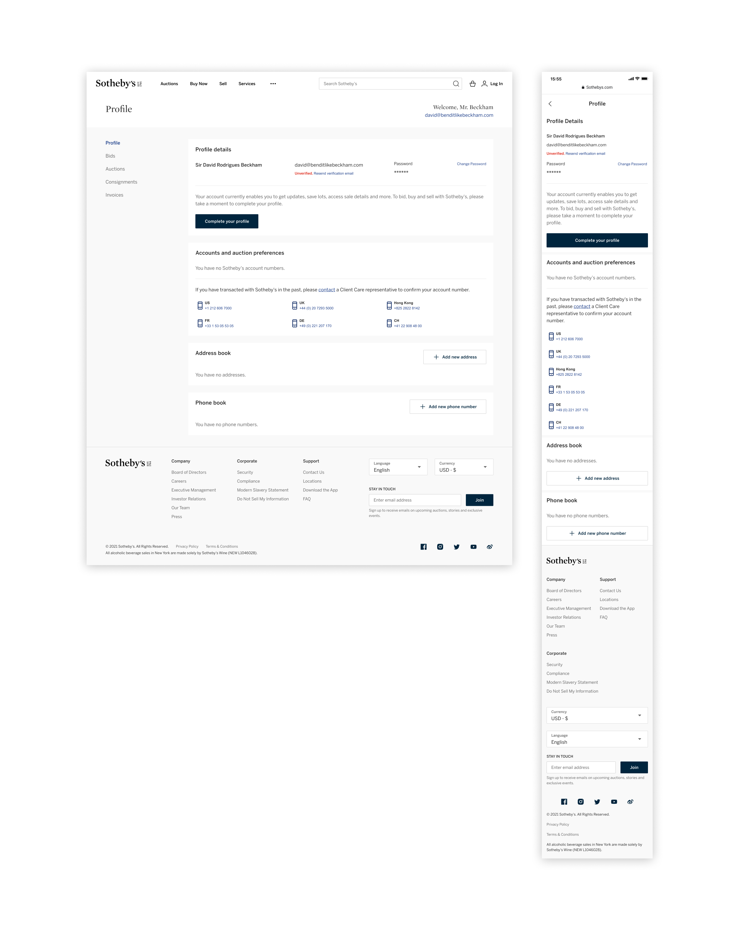
First-time collectors land on a profile that explains exactly what their account can and can't do today, paired with a single Complete your profile CTA so the upgrade path is one tap from anywhere on the page.

Sr. Product Designer
1 Product Manager
Product Design
Visual Design
UX/UI Direction
Figma
I led product design on a refreshed account profile for Sotheby’s collectors and bidders. The previous experience scattered bids, auctions, consignments, and invoices across separate flows, each with its own UI patterns. The brief was to bring them under one shelf, in one design language, on every device a collector might use to follow a sale.
Collectors at Sotheby’s span first-time bidders to long-tenured patrons, and the profile had to make every audience feel at home. The team aligned on a clear set of goals before pushing pixels.
Consolidate fragmented account flows into one profile so collectors can focus on the sale instead of hunting through tabs.
Match the Sotheby’s editorial voice and house typography across every screen so the profile feels native to the auction house, not bolted on.
Surface the bids, auctions, consignments, and invoices a collector cares about most, with parity between desktop and mobile so action is always one tap away.
I partnered with the PM to interview collectors and the specialists who manage their accounts: where they pick up the journey, what they expect at the moment of a live auction, and which signals they trust. We mapped the existing profile end-to-end and synthesized the patterns into a shared vocabulary the design system and engineering teams could build against.
The refreshed profile brings every account view, bids, auctions, consignments, and invoices, into a single shelf with consistent navigation, filters, and live status. Tablet, desktop, and mobile all use the same component library so a bid placed at home feels identical to one placed in a saleroom.
An at-a-glance banner confirms whether a collector has bids in flight, with the lot, sale time, and status pulled forward instead of buried behind tabs.
Active, won, and lost views, plus account-number filters, let collectors narrow the profile to whichever sale or paddle they need to focus on right now.
The same navigation, status chips, and bid summaries render at full fidelity on mobile, so a collector tracking a sale on the train sees what they would see on desktop.

Profile work is mostly states, the small banners and inline prompts that tell a collector what they can do today and what's blocking them from doing more. I treated each one as a first-class screen so the chrome stays calm whether someone is verifying ID for the first time or running into a shipping restriction on a Tuesday afternoon.
First-time collectors land on a profile that explains exactly what their account can and can't do today, paired with a single Complete your profile CTA so the upgrade path is one tap from anywhere on the page.
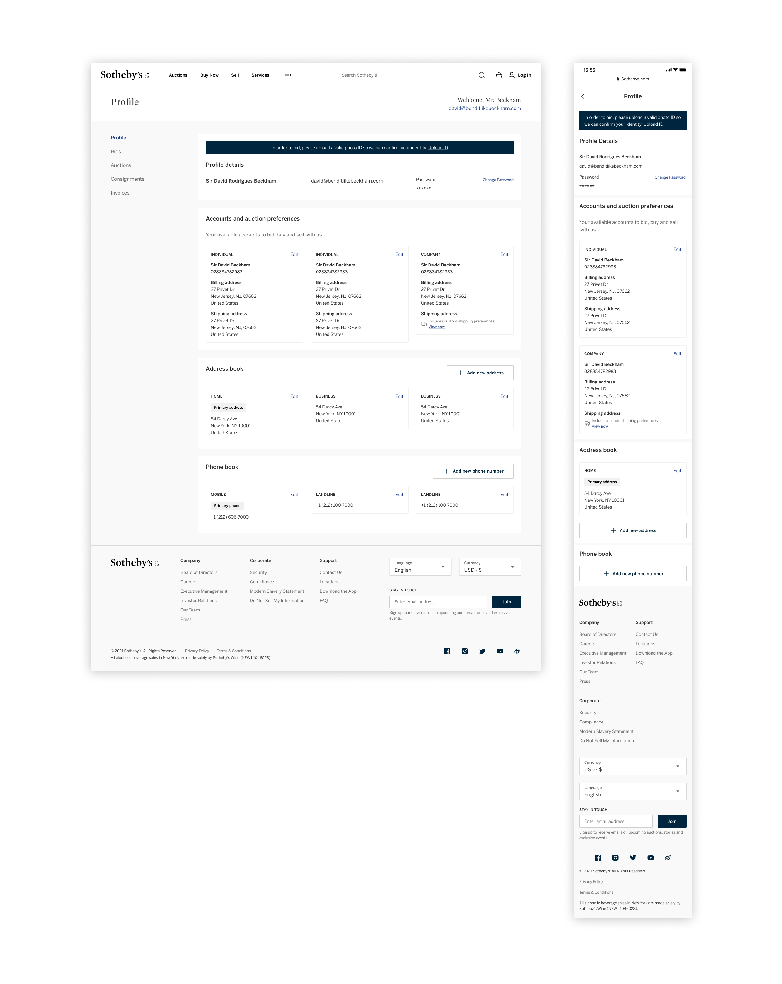
A high-contrast banner up top tells collectors what's gating them from bidding and links straight to the upload flow, so the rejection happens here, not in the middle of a saleroom.
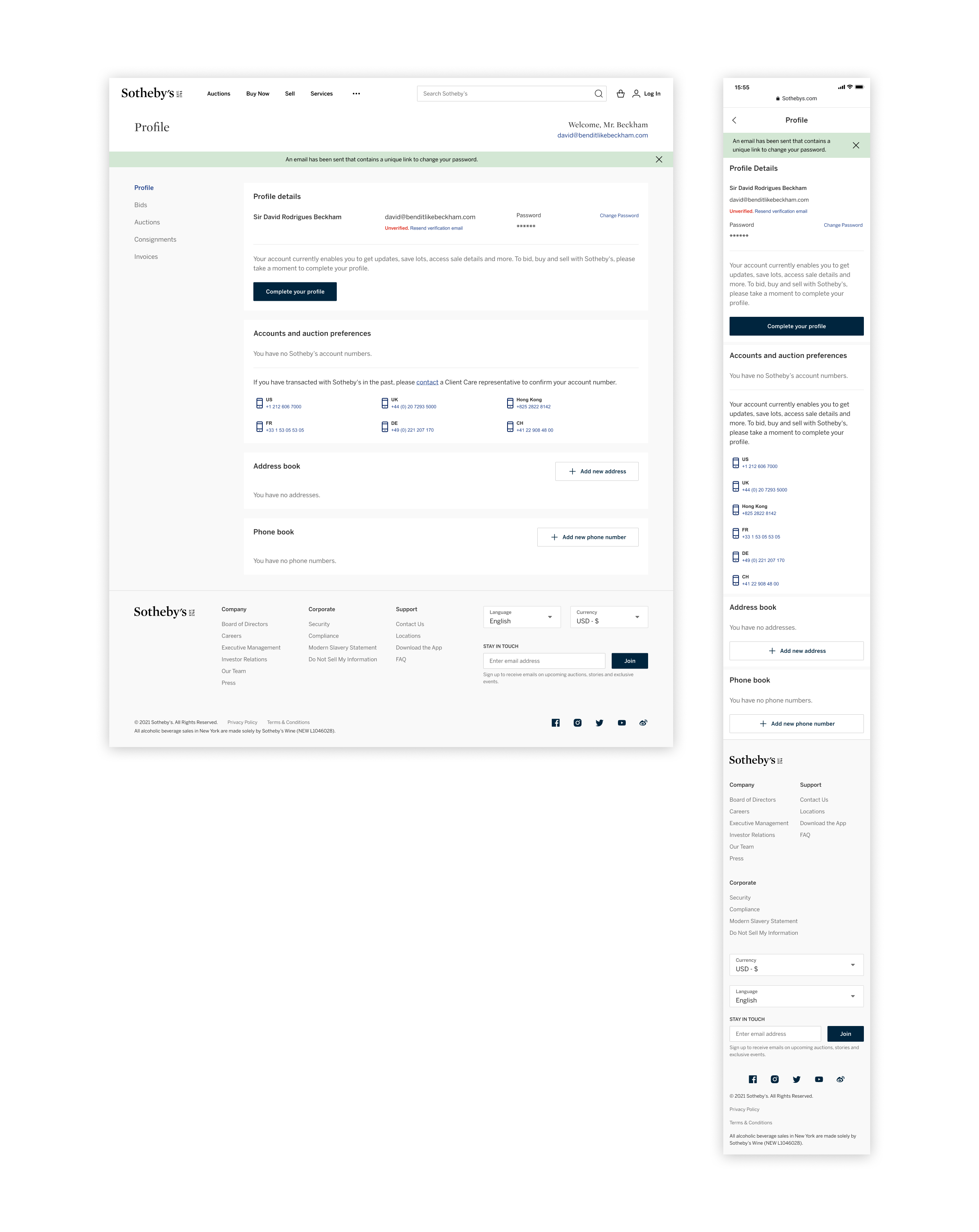
After requesting a reset, a green system banner confirms the email is on its way and points back to the unverified row, so collectors can finish re-verifying without leaving the page.
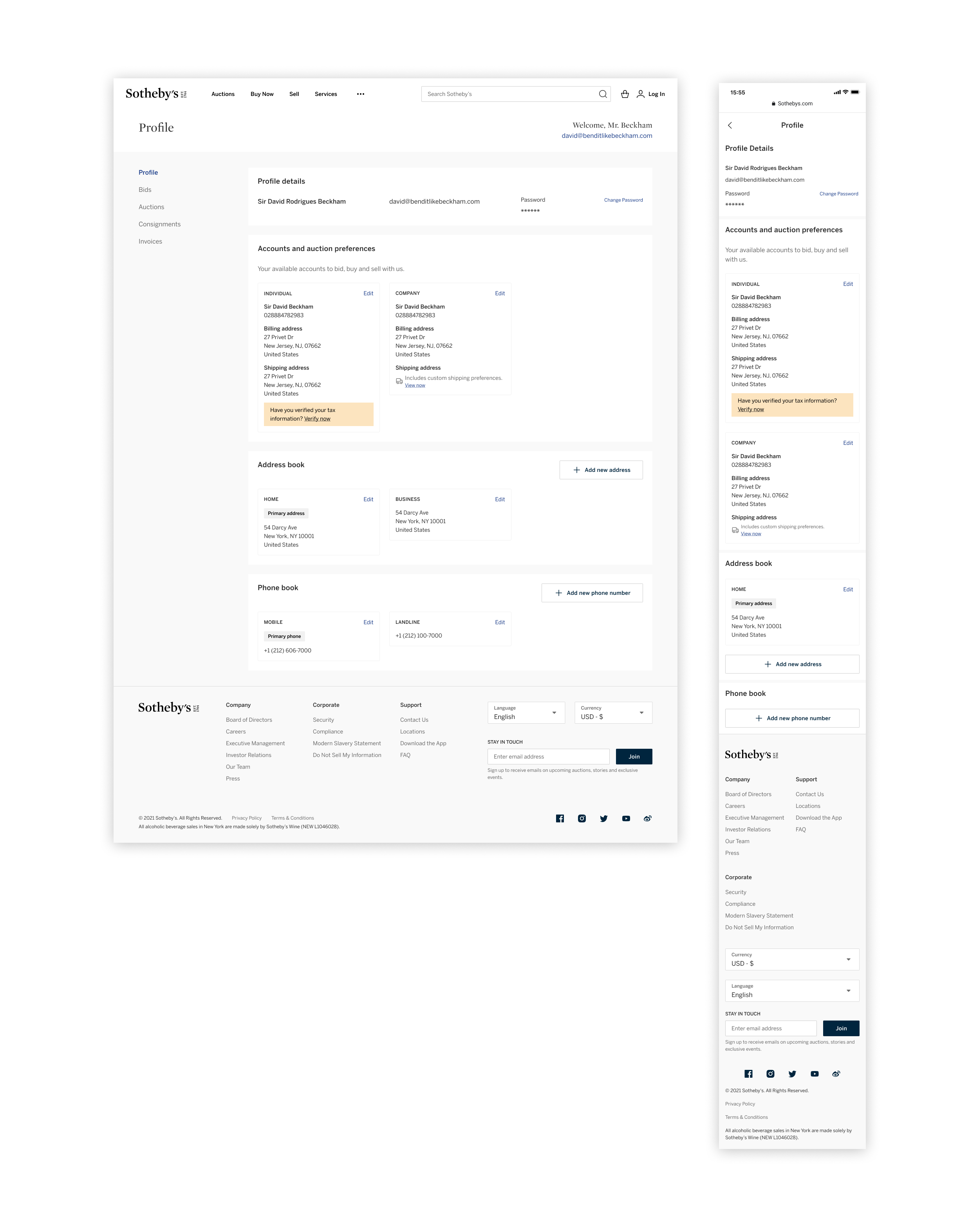
Inline reminders sit inside the account they belong to, so a tax verification nudge shows up on the individual or company that needs it instead of as another full-width banner up top.
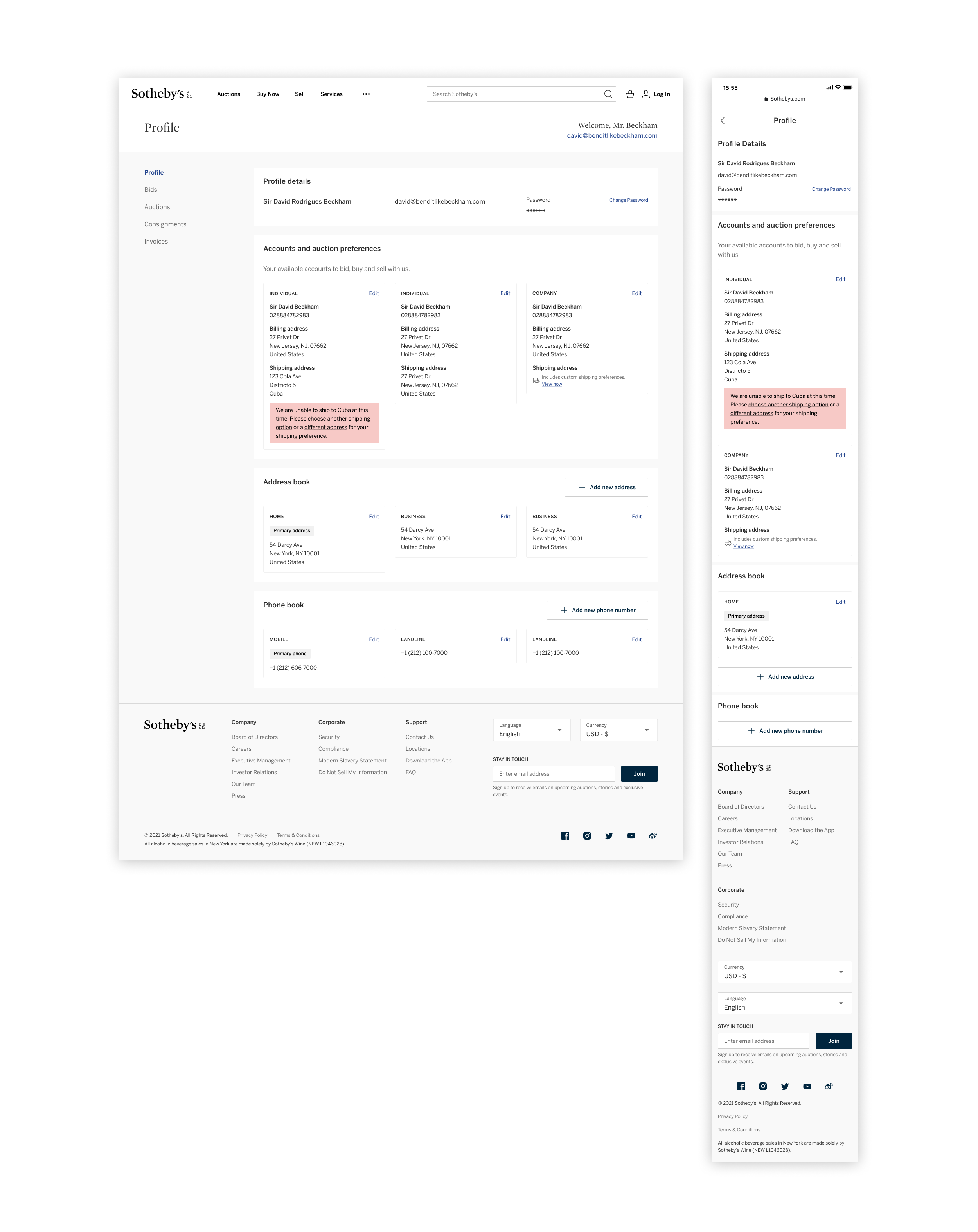
When an address falls outside what Sotheby's can ship, a red inline notice flags the issue on the specific account and offers two recovery links, so the collector can correct it without contacting Client Care.
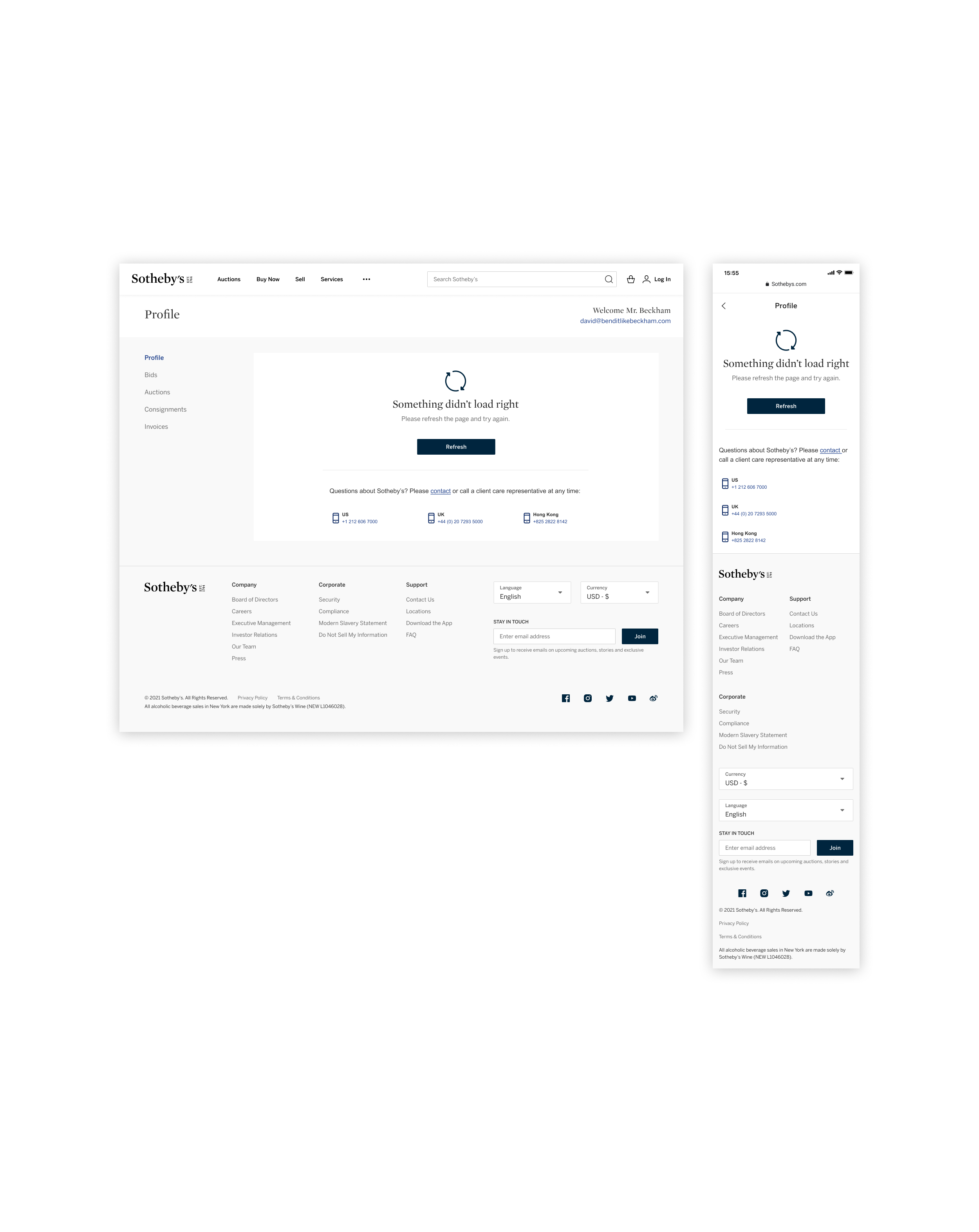
When something fails to load, the profile collapses to a calm error state with a single Refresh action and Client Care numbers, so a collector always has a path forward instead of a dead screen.
Bids needed a shared shelf that could hold every status a lot can pass through, before, during, and after the hammer, on web and mobile. Each variant below uses the same row, the same status chip family, and the same account-number metadata, so a collector tracking five sales reads them all at the same glance.
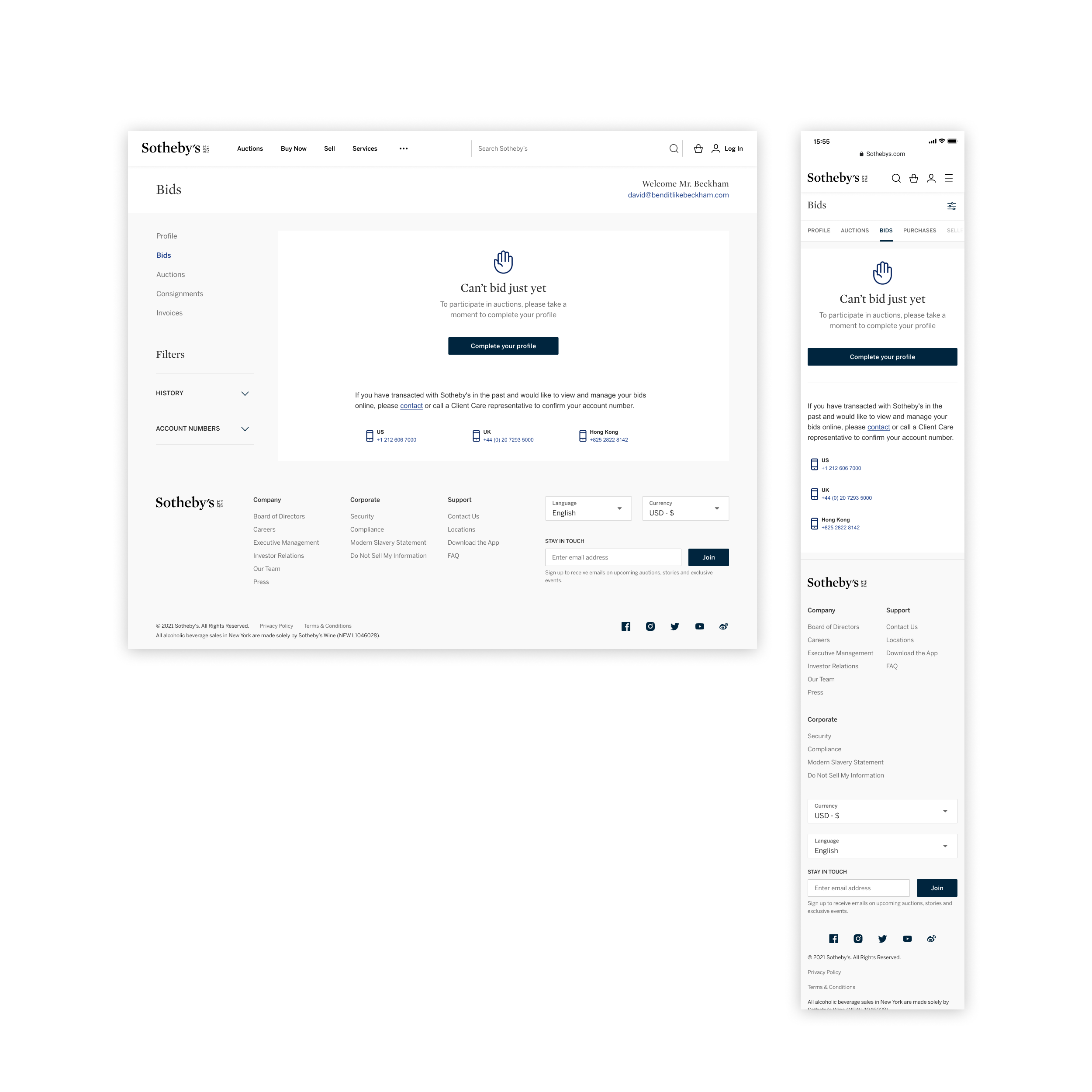
Pre-verification, the empty state explains why bidding is gated and routes the collector to Complete your profile, with Client Care numbers as a fallback for legacy paddle holders.
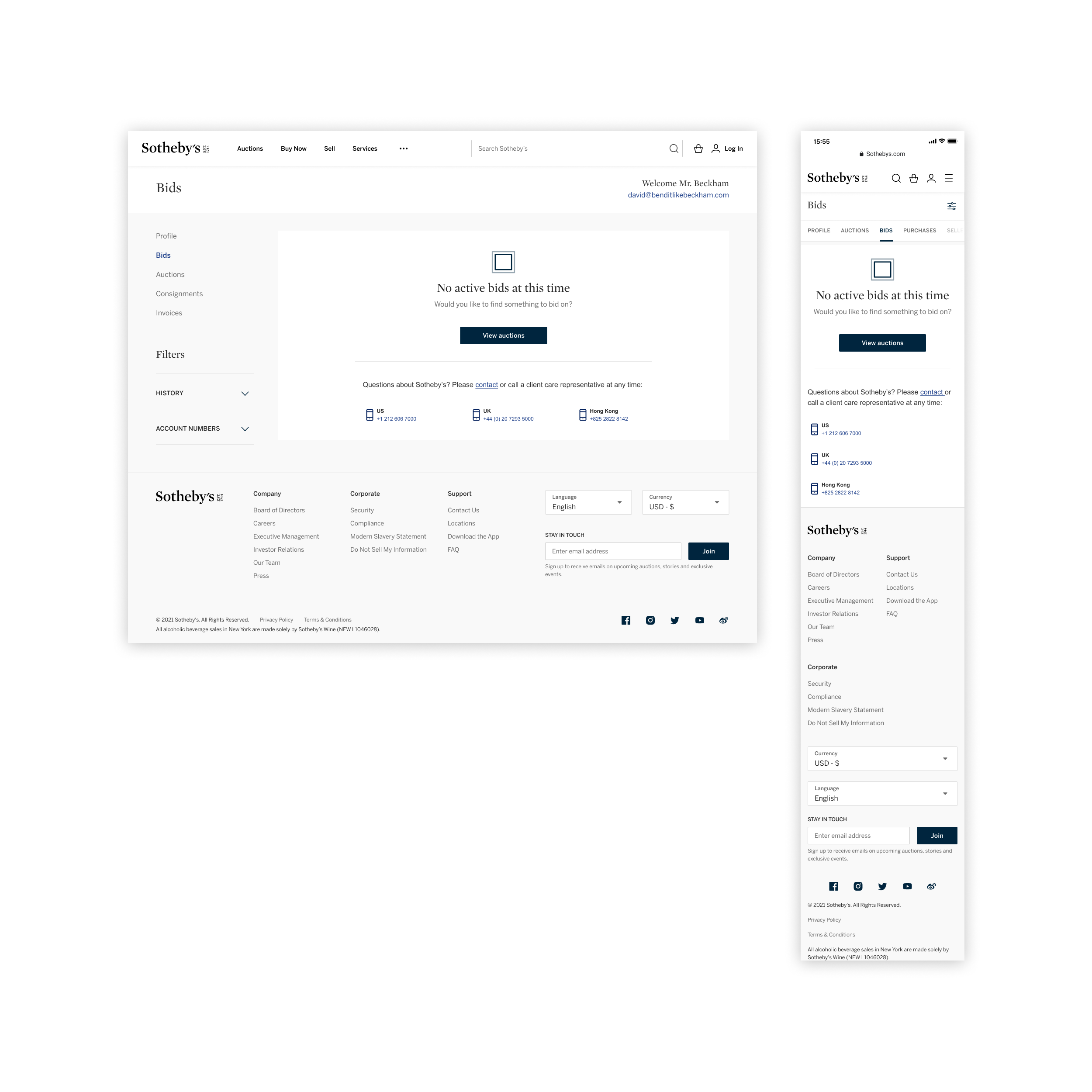
Verified collectors with nothing in flight get a calm empty state and a single View auctions CTA, instead of a blank page that leaves them wondering whether something broke.
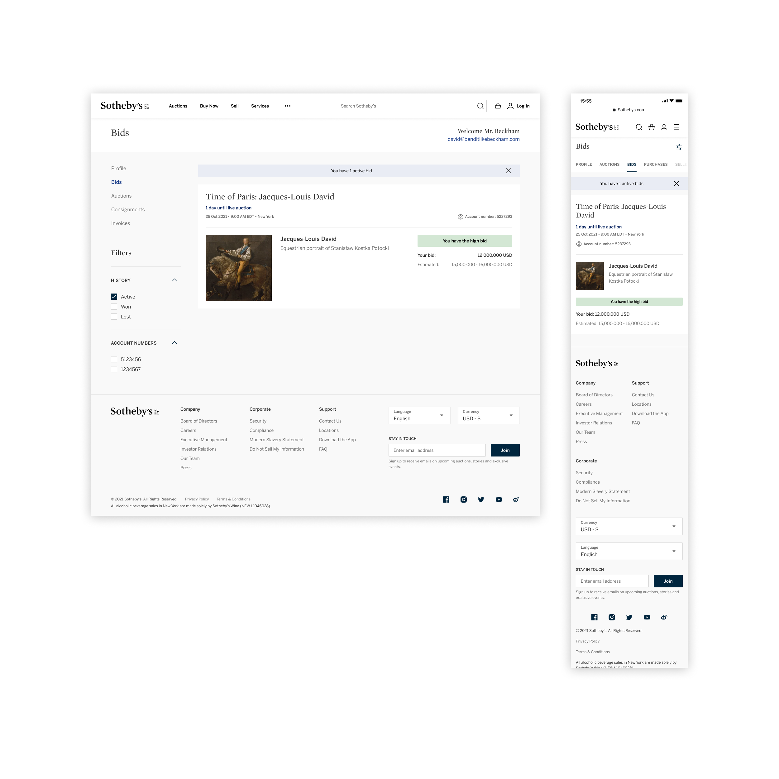
A green status pill confirms the collector currently holds the high bid and pulls the lot, sale time, account number, and current bid into a single shelf at the top of the page.
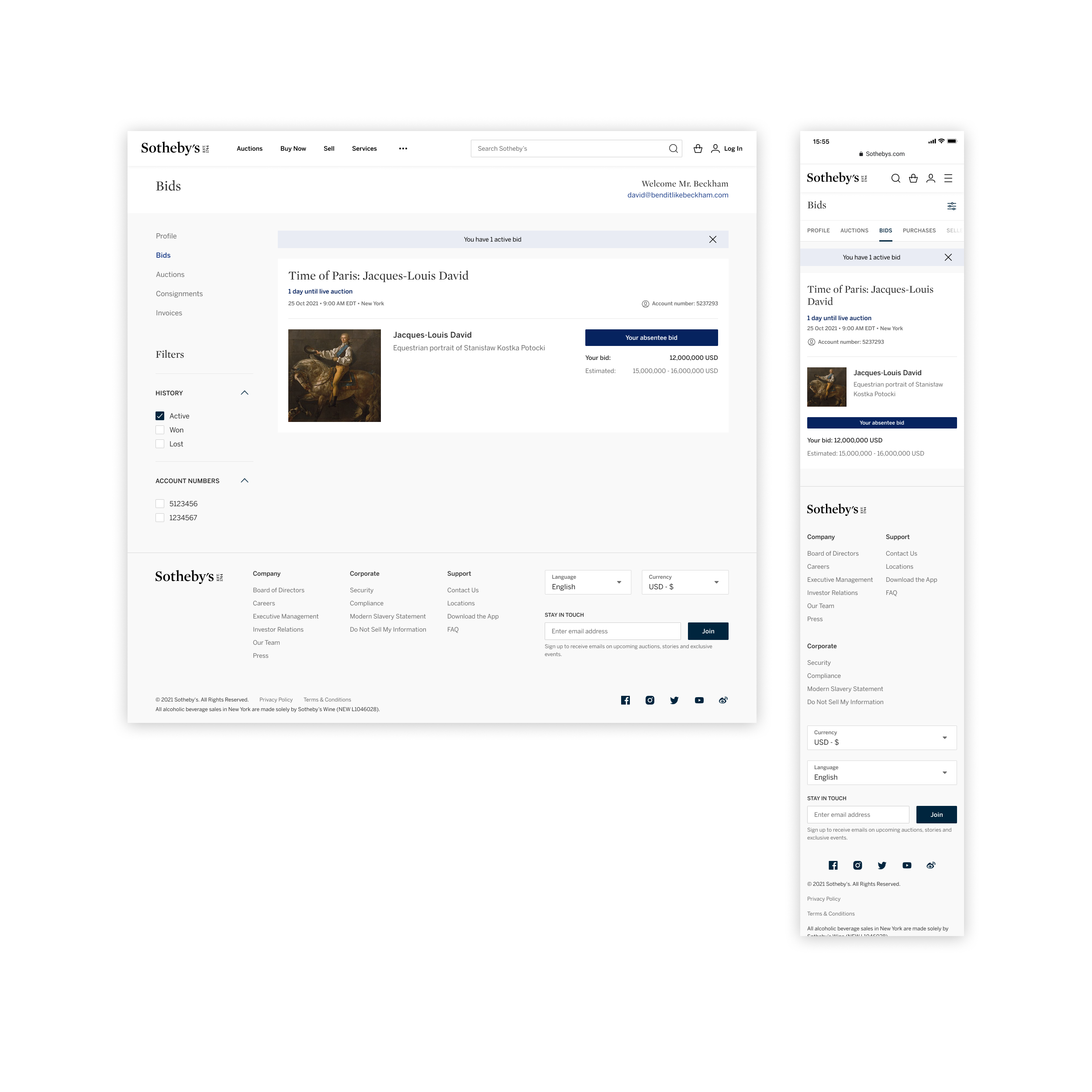
A blue status pill marks lots where the collector left an absentee bid, so they can keep tabs on a sale they can't watch live without digging through emails or calling Client Care.
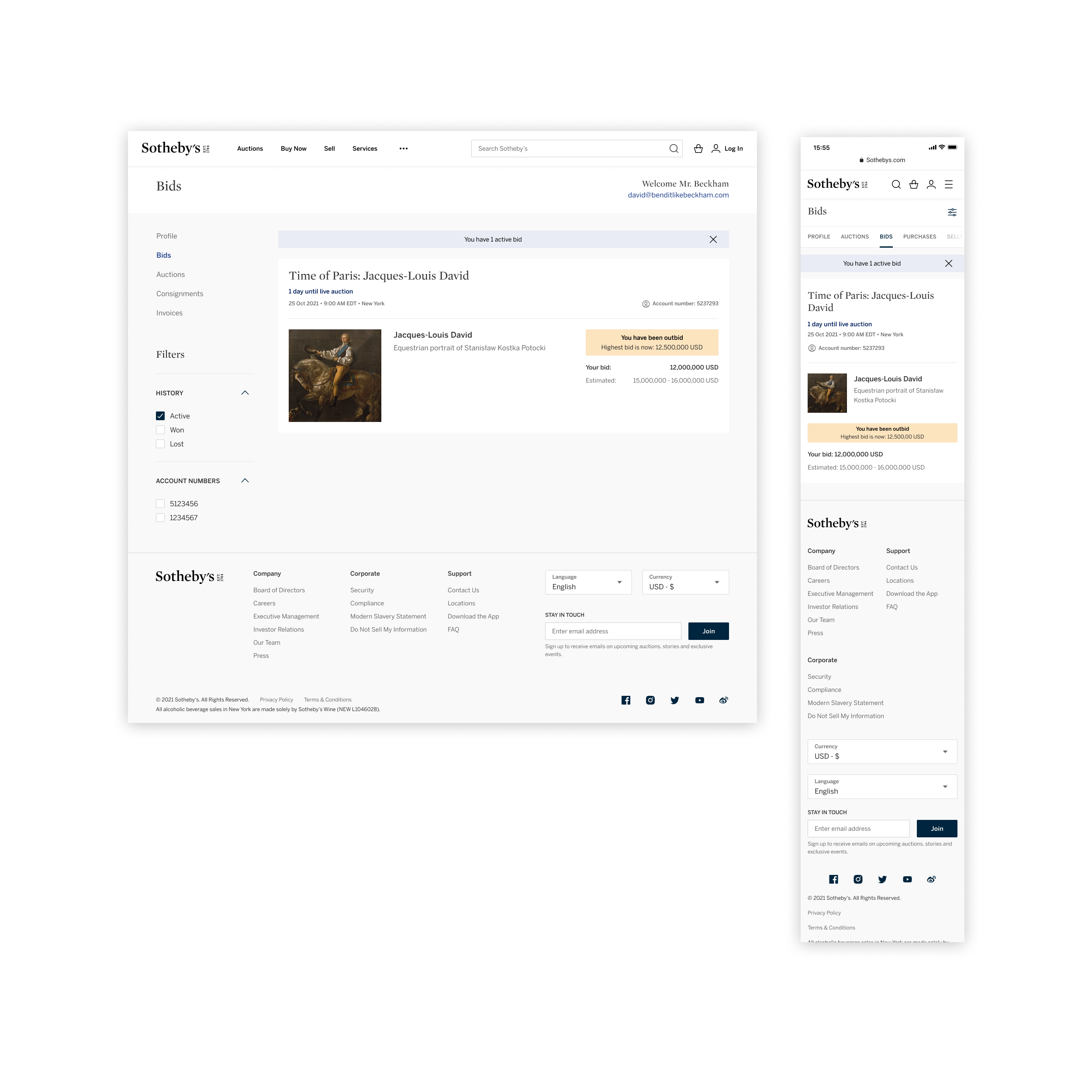
When a collector is outbid, the row surfaces the new high bid in-line, so they can decide whether to come back over the top in one move instead of opening the lot detail to find the number.
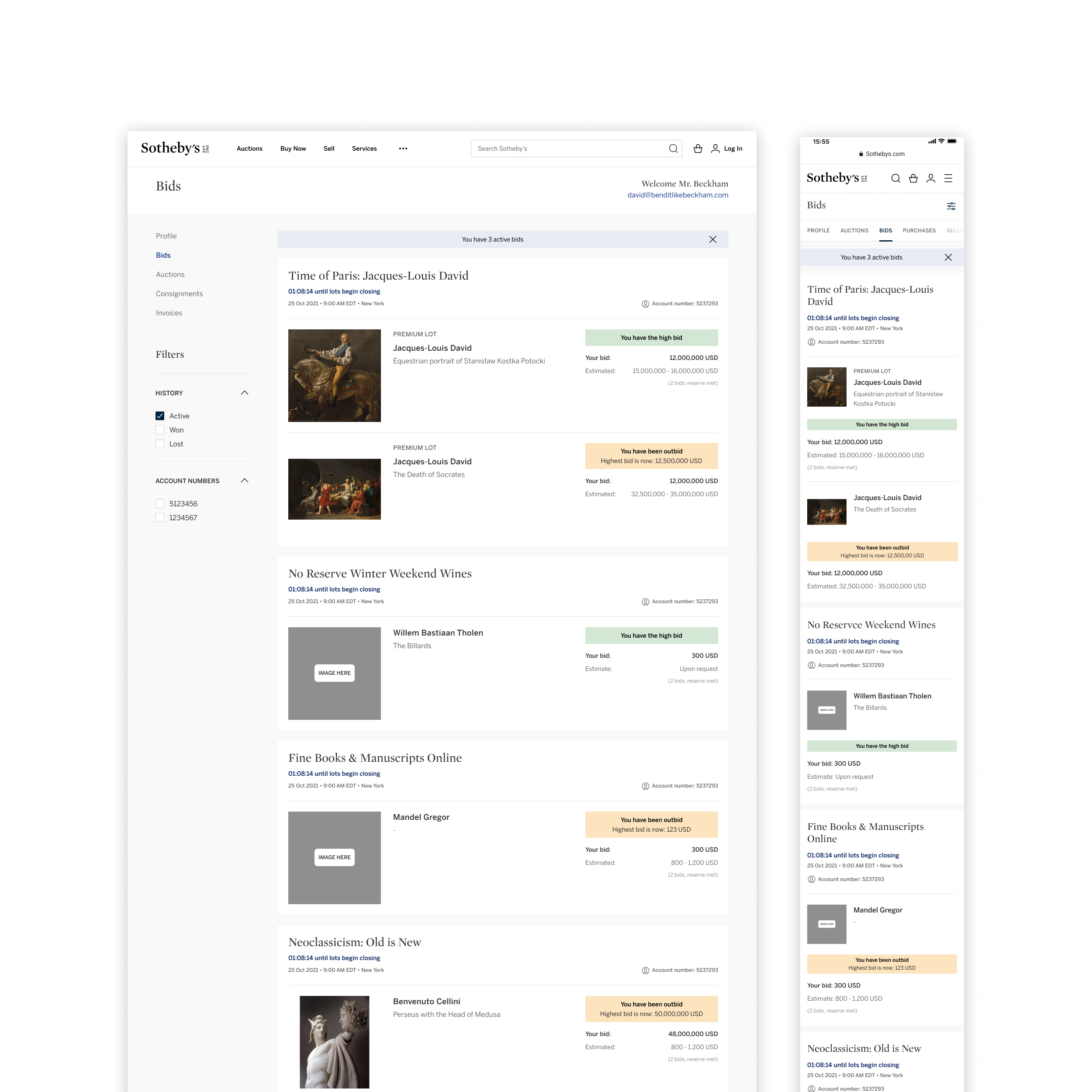
Bids group by sale and account number, with statuses pinned next to each lot, so collectors tracking several auctions at once can scan the entire field instead of opening each sale separately.
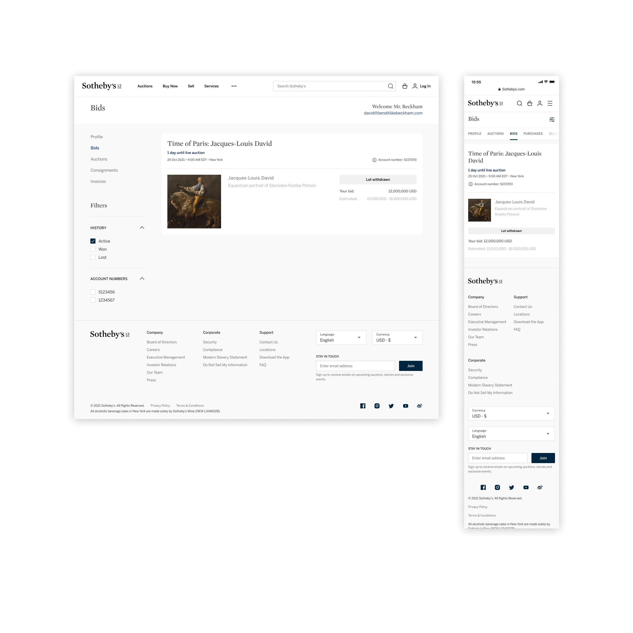
When a lot is withdrawn from sale, the row dims to a neutral chip so the collector knows immediately that no further action is needed and the bid is closed out.
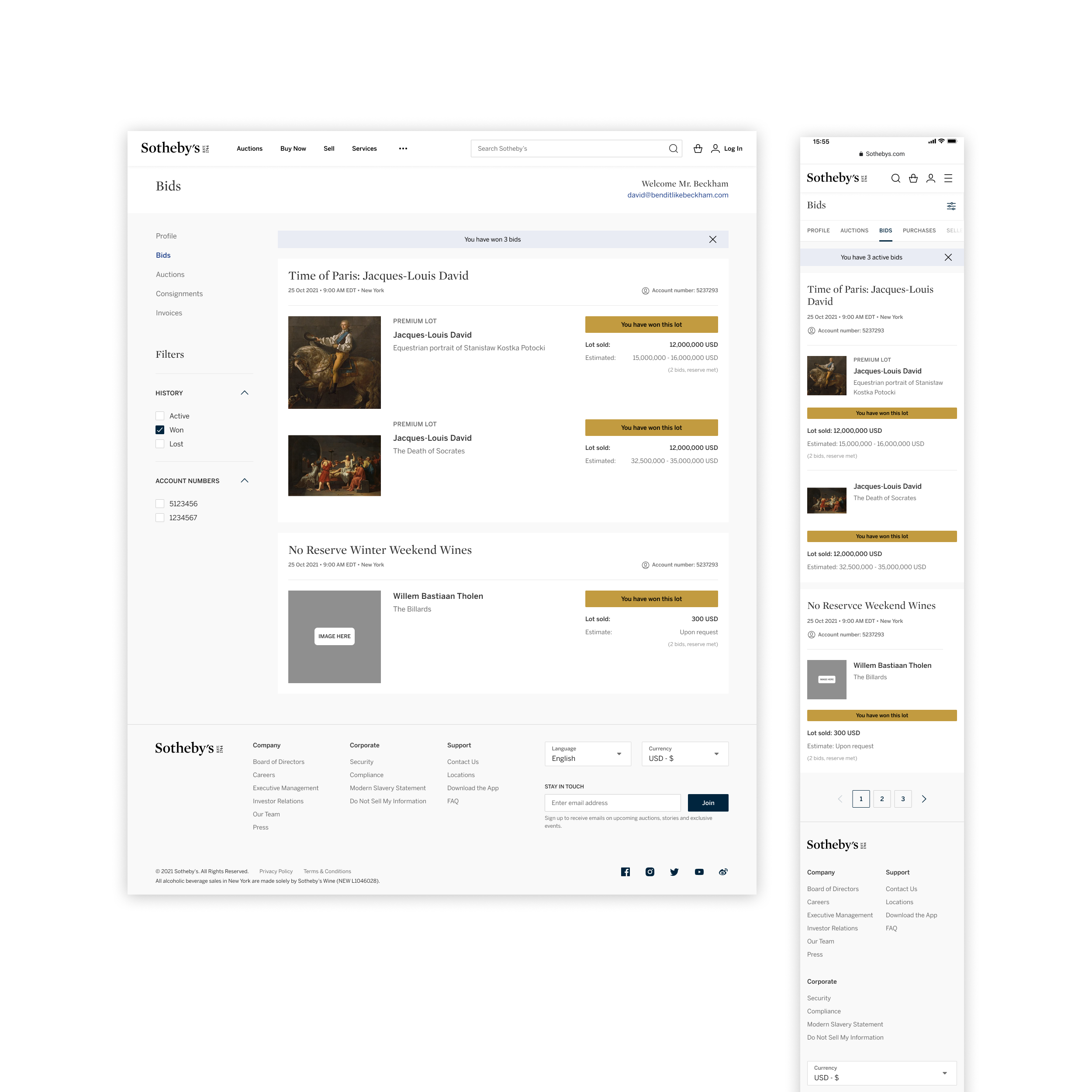
Gold status pills celebrate the lots a collector has won, with the final lot price and the same shelf treatment used during the live sale, so the historical record reads as part of the same profile.
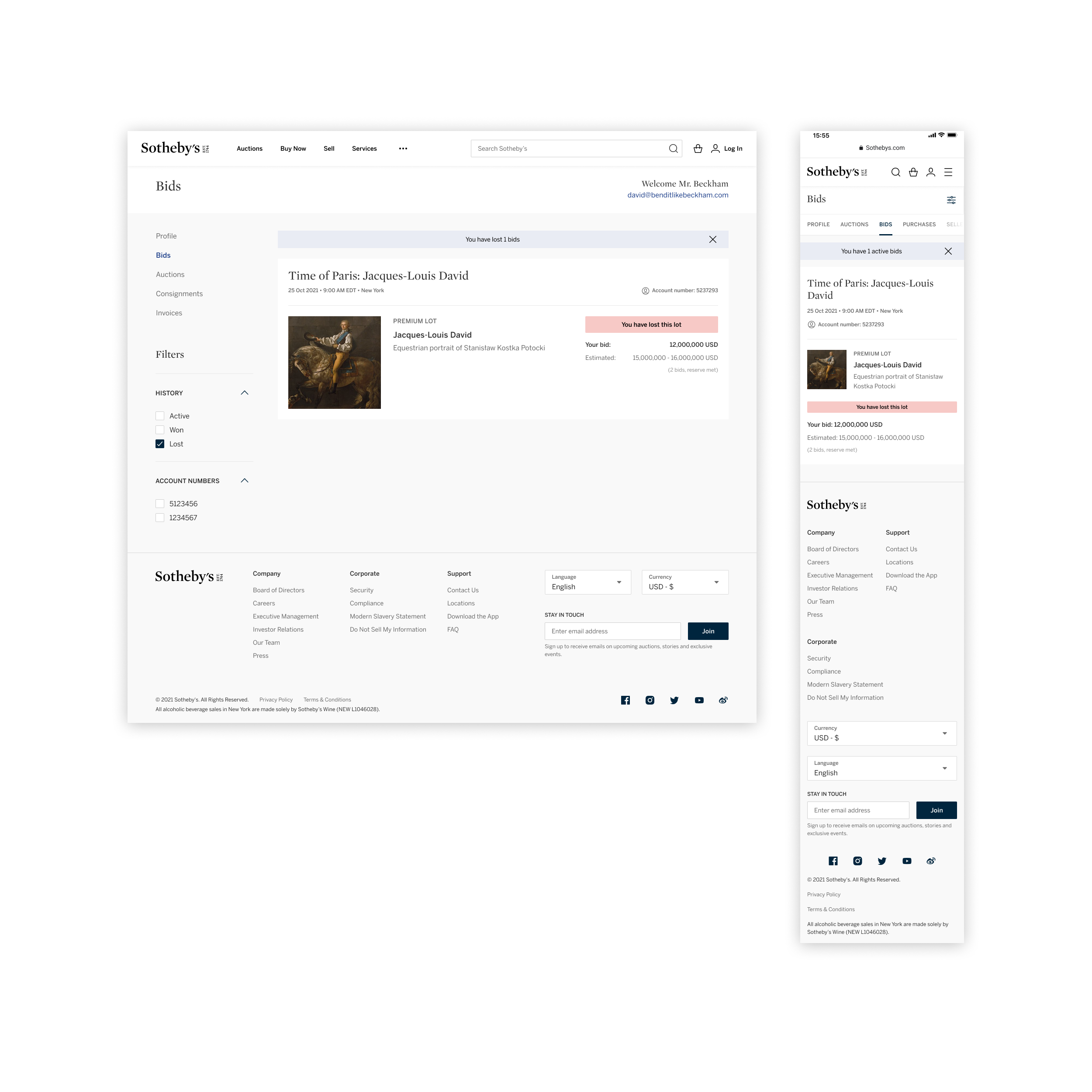
Lost lots roll up under a quieter pink status, with the collector's bid and the estimate kept on screen for context, instead of disappearing the lot from the profile altogether.
Bids, auctions, consignments, and invoices consolidated into a single account experience, with every prompt, banner, and bid status documented as part of the same shelf.
Every state and status, from upgrade prompts to high-bid, outbid, won, and lost, ships at parity across desktop and mobile so collectors can follow a sale wherever they are.
Built on the Sotheby’s house design system, so future account views inherit the same components, status family, type, and motion.