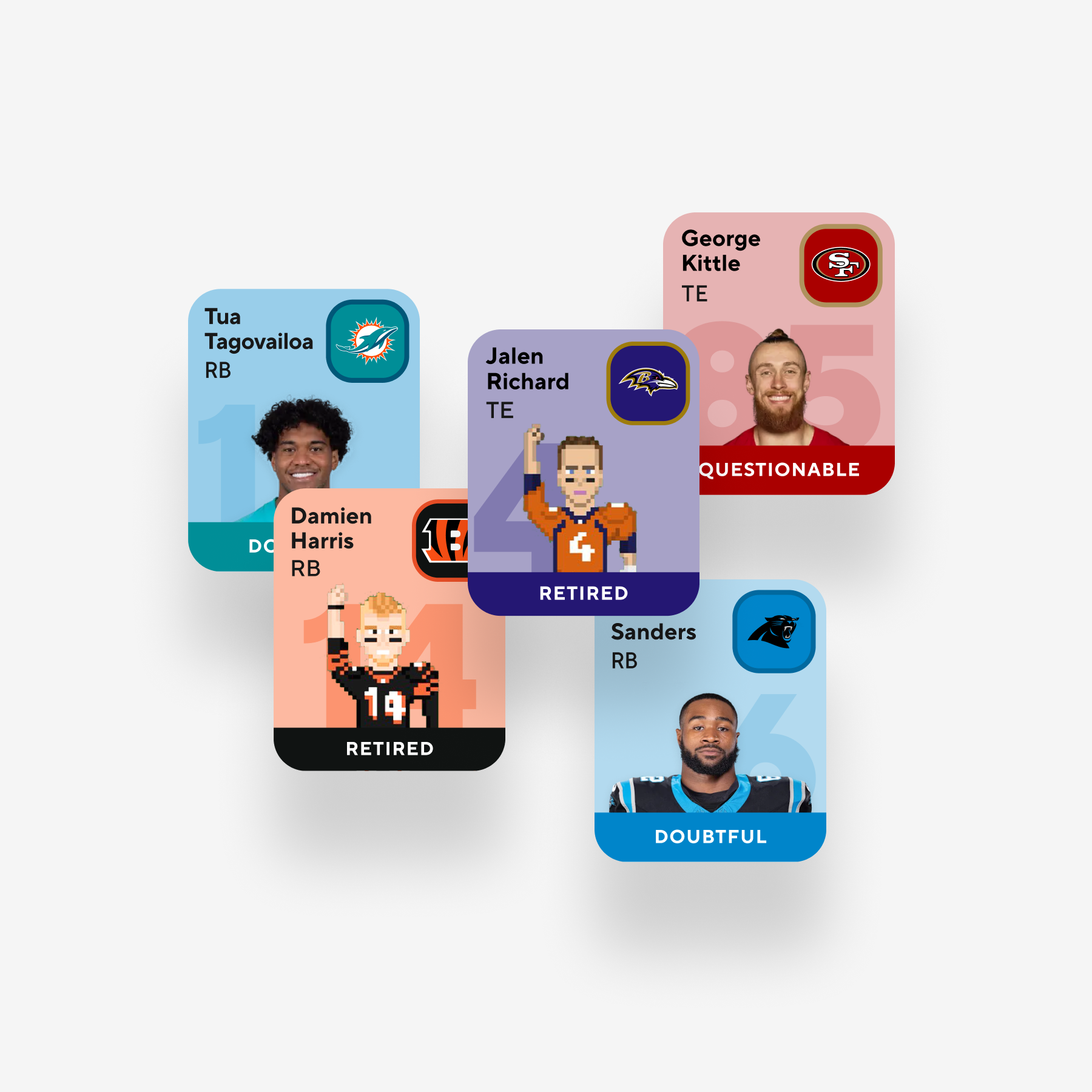
Player profile, mobile
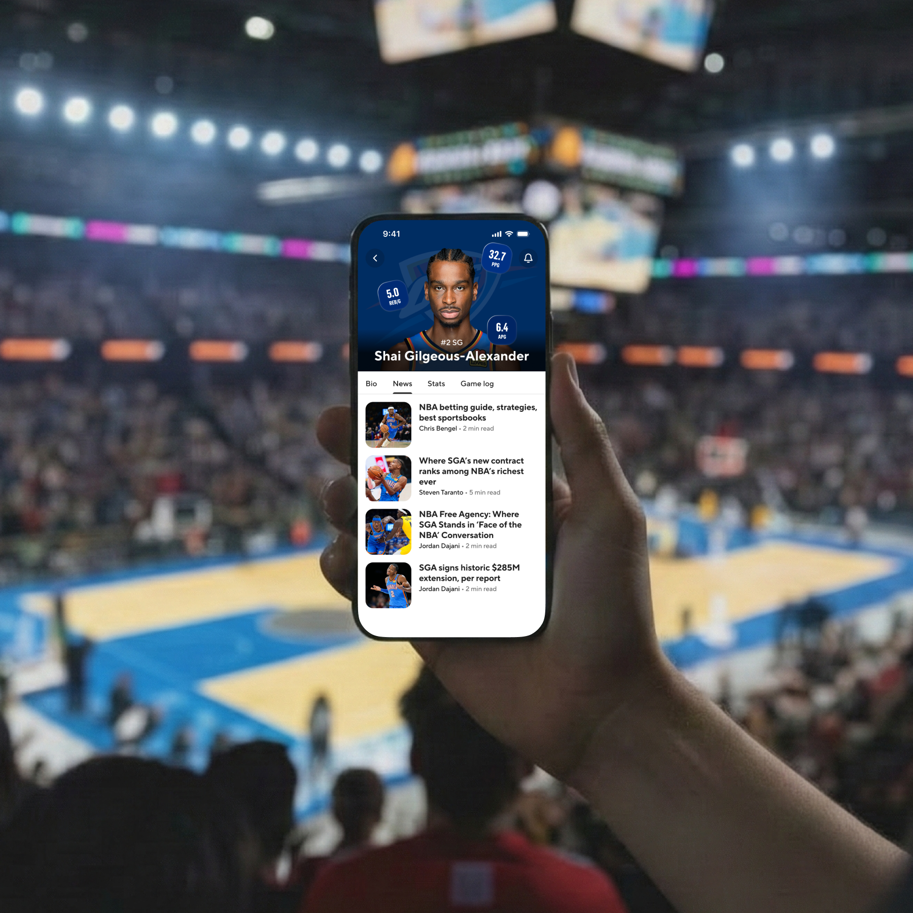
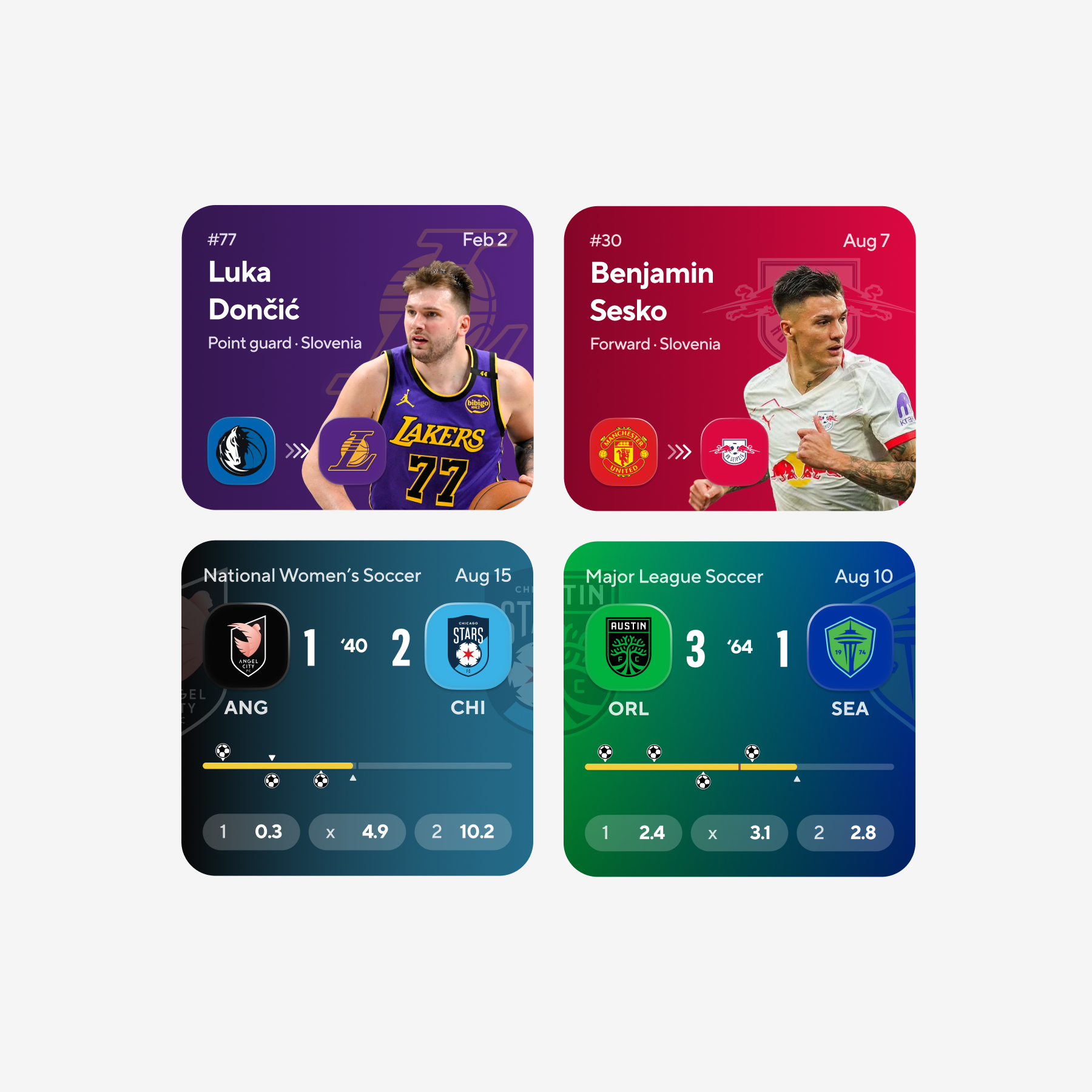
On mobile, I anchored the profile on the athlete: bold team washes, light dividers, and type that establishes name and role before users scroll into counting stats.
Sr. Product Designer
1 Design Director
1 Associate Product Designer
Design Systems
Product Design
Visual Design
Motion
Figma
Vanguard was scoped around a clear brief: modern sports fans deserve a product that keeps pace with how they watch. We needed the CBS Sports broadcast voice to read online without every surface becoming a one-off composition, and we needed the interaction layer to stop fragmenting so engineering wasn't rebuilding the same score chrome across three independent stacks. I owned the system end to end (the baseline kit, the cross-surface applications on mobile, web, and CTV, and the documentation package that fed engineering), essentially everything outside of motion. The Associate Product Designer ran the motion pieces alongside me, and the Design Director served as our sign-off and approval checkpoint with minimal oversight, primarily stepping in to coordinate with cross-org stakeholders such as the Data and broadcast teams.
CBS Sports' digital surfaces accumulated over time as parallel efforts: score headers with mismatched rules, matchup heroes that didn't share logic, tables that conflicted on specifications. Shipping a feature meant renegotiating those fundamentals every cycle. Vanguard exists to ship one interaction grammar and one component layer that teams can adopt, so they're not solving the same problem on every roadmap.
Reduce the time required to ship feature work by giving every team a shared component vocabulary rather than a per-product rebuild.
Make CBS Sports feel like one network across mobile, web, and CTV, carrying broadcast cues into product surfaces without losing the energy fans associate with the brand.
Resolve the recurring pattern debates around the score header, matchup, table, and article with documented behavior teams can adopt rather than relitigate.
Before anything was finalized, we pushed type, color, and illustration to understand how expressive CBS Sports could be on screen while still reading as CBS Sports. This exploration phase wasn't about selecting a final direction on day one; it was about identifying the guardrails.
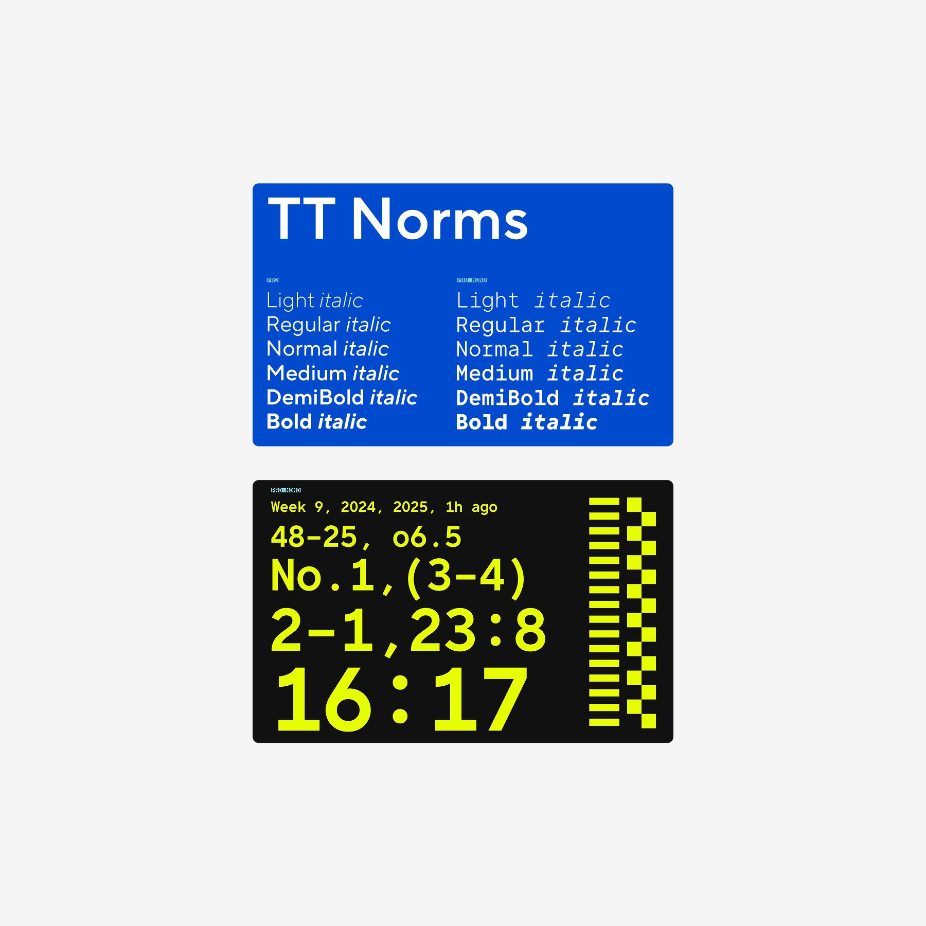
We evaluated typefaces that could carry impact in headlines and still hold dense stats without losing legibility. TT Norms handles narrative and headline work; TT Norms Mono handles the figures so scores and tables maintain their rhythm under heavy data loads.
First passes intentionally pushed saturation and density so we could identify the upper limit while the brand still felt like CBS Sports. We wanted the failure points surfaced in exploration rather than in production.
Pixel-style 16-bit illustration tests added a younger art direction that could sit alongside traditional broadcast polish without reading as a separate product.
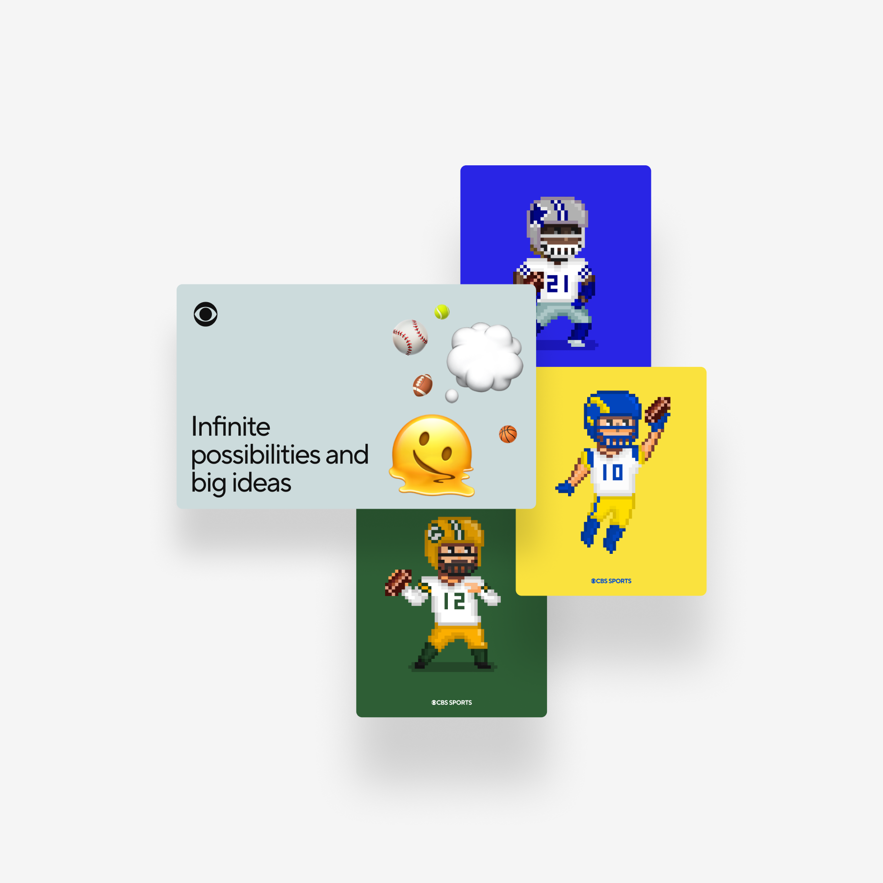
We applied those illustration directions to collectable cards and promo modules to see which approaches held up against CBS' established on-air tone. Many were intentionally set aside as a result of those tests.
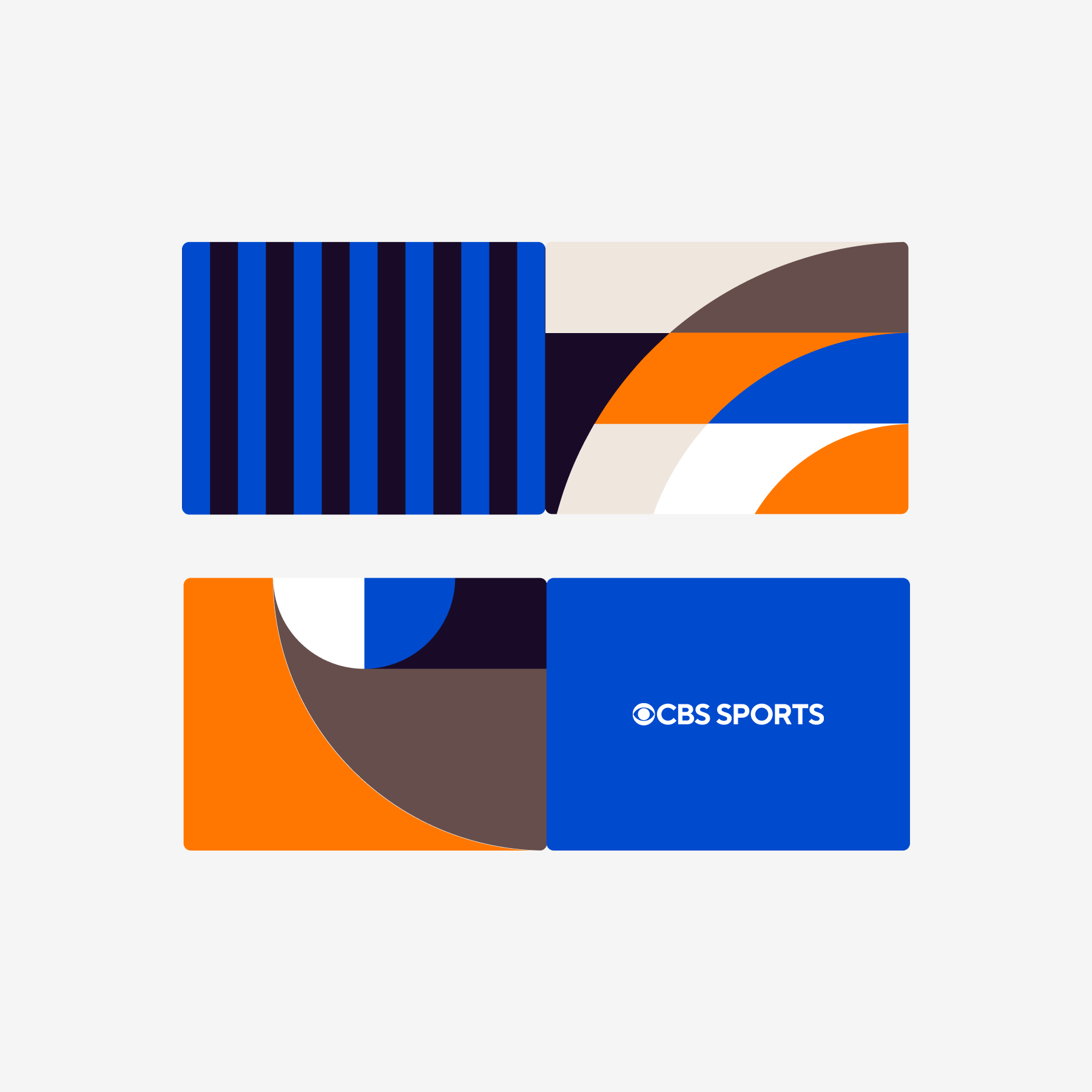
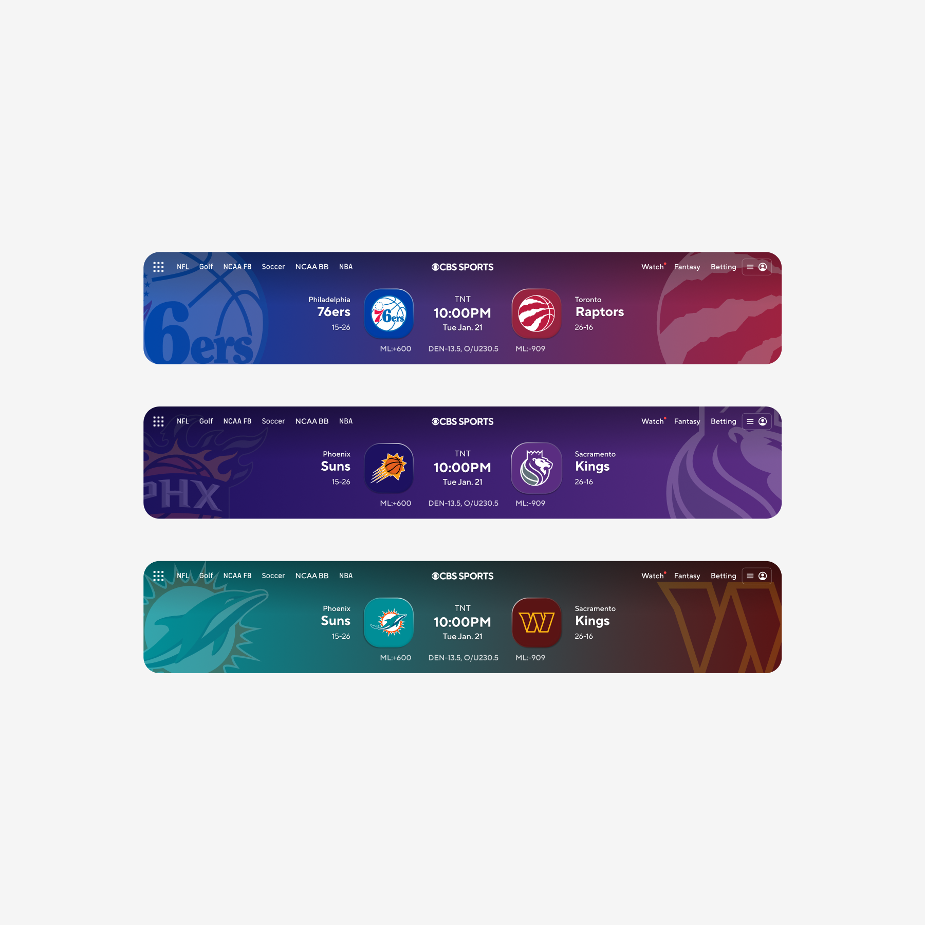
We allowed club palettes to drive the shell on matchup work to gauge how much fan emotion the frame could carry before becoming visually overloaded.
Live games set the tempo. Vanguard's role was to follow that tempo rather than override it. Patterns were retained only if they felt responsive in hand and still held up at lean-back distance without requiring a bespoke variant.
Motion was the most difficult layer to keep consistent across teams, so we documented it first. The short list below became the default for any animated component, from an incrementing stat to a score header that opens at kickoff.
Animation is constrained. Durations and easing pairs come from a compact chart so nothing drifts out of step or runs ahead of the rest of the UI.
When a surface lifts or slides, its children follow the same timing stack so hierarchy reads as a single gesture rather than several unrelated tweens.
Movement should feel athletic: a quick snap in, a slight recoil, momentum that draws the eye forward. We avoided floaty motion that exists purely for decoration.
Timing curves on paper don't tell the full story. The clip below is one of the small live tests we built where component, motion, and team color come together on screen.
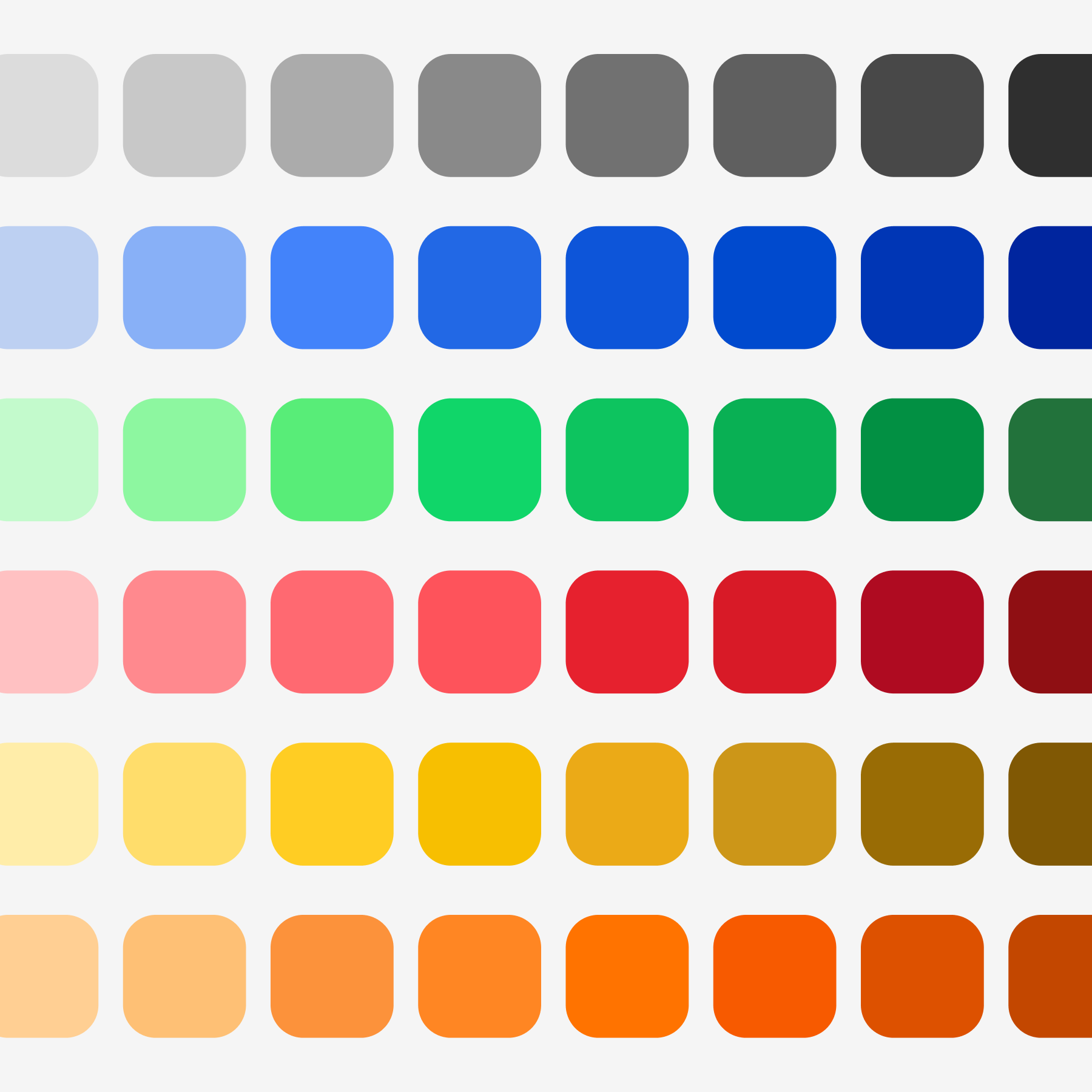
Once the tokens stabilized, we organized color, type, and icons into documented lanes and stress-tested them with A/B variants, transparency studies, and dense layout mocks. We needed proof that the base layer could support both high-energy game moments and quieter reading states without one undermining the other.
We pushed brighter accents while keeping the foundation rooted in the CBS core ramps. Team colors plug into named slots for surface, accent, and motion washes so a rivalry reads as distinct without each team inventing its own chrome.
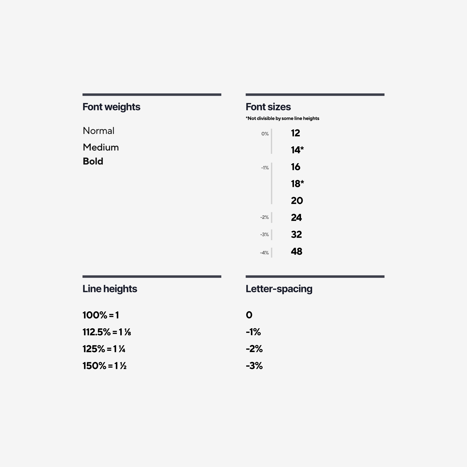
We reduced the scale to three weights, tightened spacing, and validated the same spec on web, mobile, and CTV. That range provided enough hierarchy without turning the living-room view into a collection of competing styles.
We compared a few families side by side and kept the set that aligns with TT Norms' geometry. It needed to feel approachable on phone glass, stay crisp at ten feet, and cover Sports without one-off custom glyphs.
We iterated stroke weight, corner radius, and proportion until glyphs and letterforms read as if they came from the same source. No icon should appear to belong to a different kit.
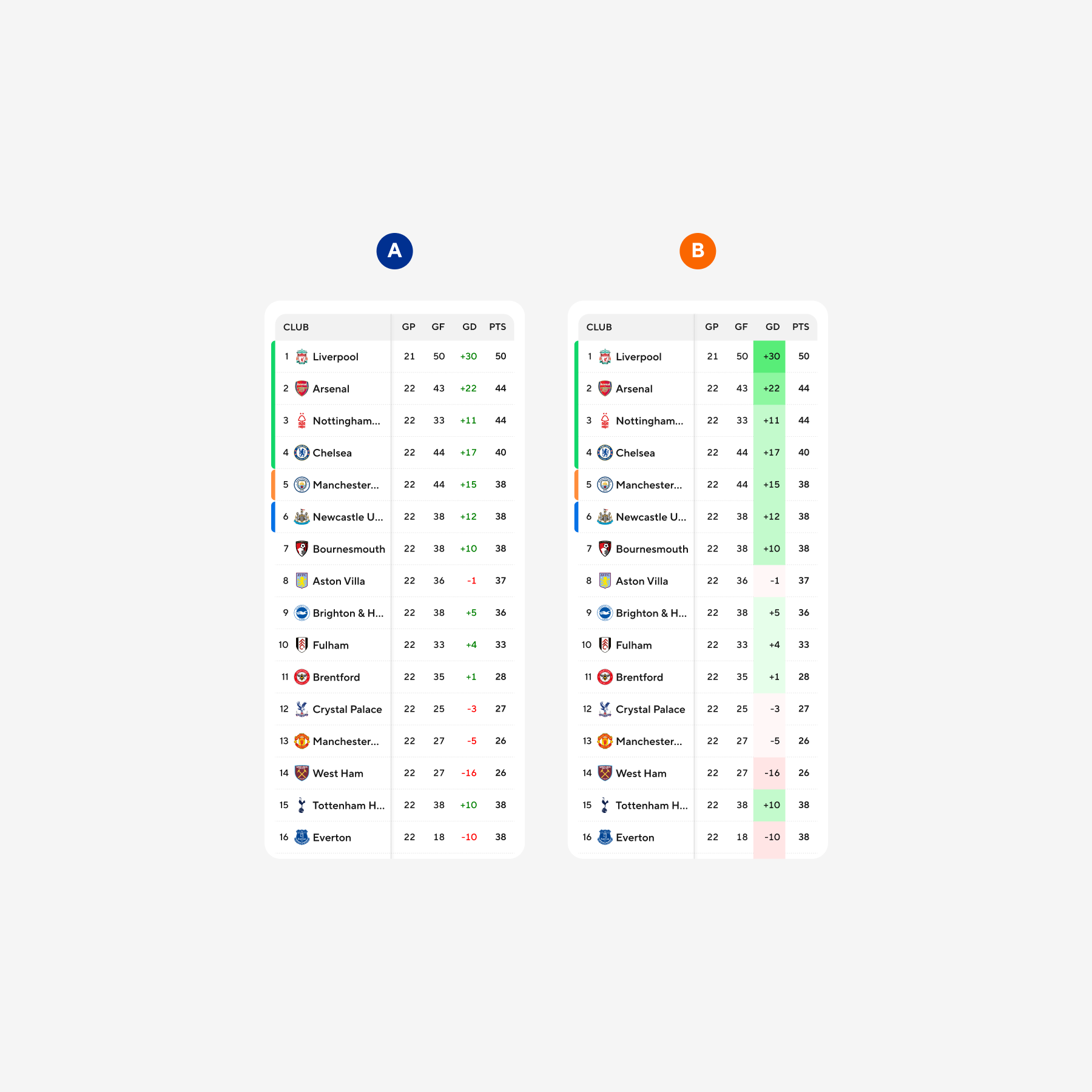
Rounds of user and internal critique refined the grids for box scores and stats until they remained readable while still carrying personality. Tables rarely deliver all of those qualities at once; we worked toward the right compromise.
Accessibility remained part of the brief throughout. We tuned glass, blur, and tint until overlays held type over grass, ice, and parquet without flattening the texture viewers expect from a broadcast.
First boards pushed saturation and motion to find the upper limit; later passes pulled the volume back toward what we expected to actually ship.
Wider mocks combined charts, long-form reads, and dense stat blocks into one viewport to confirm the kit still read as a single CBS Sports product rather than a collection of special cases.
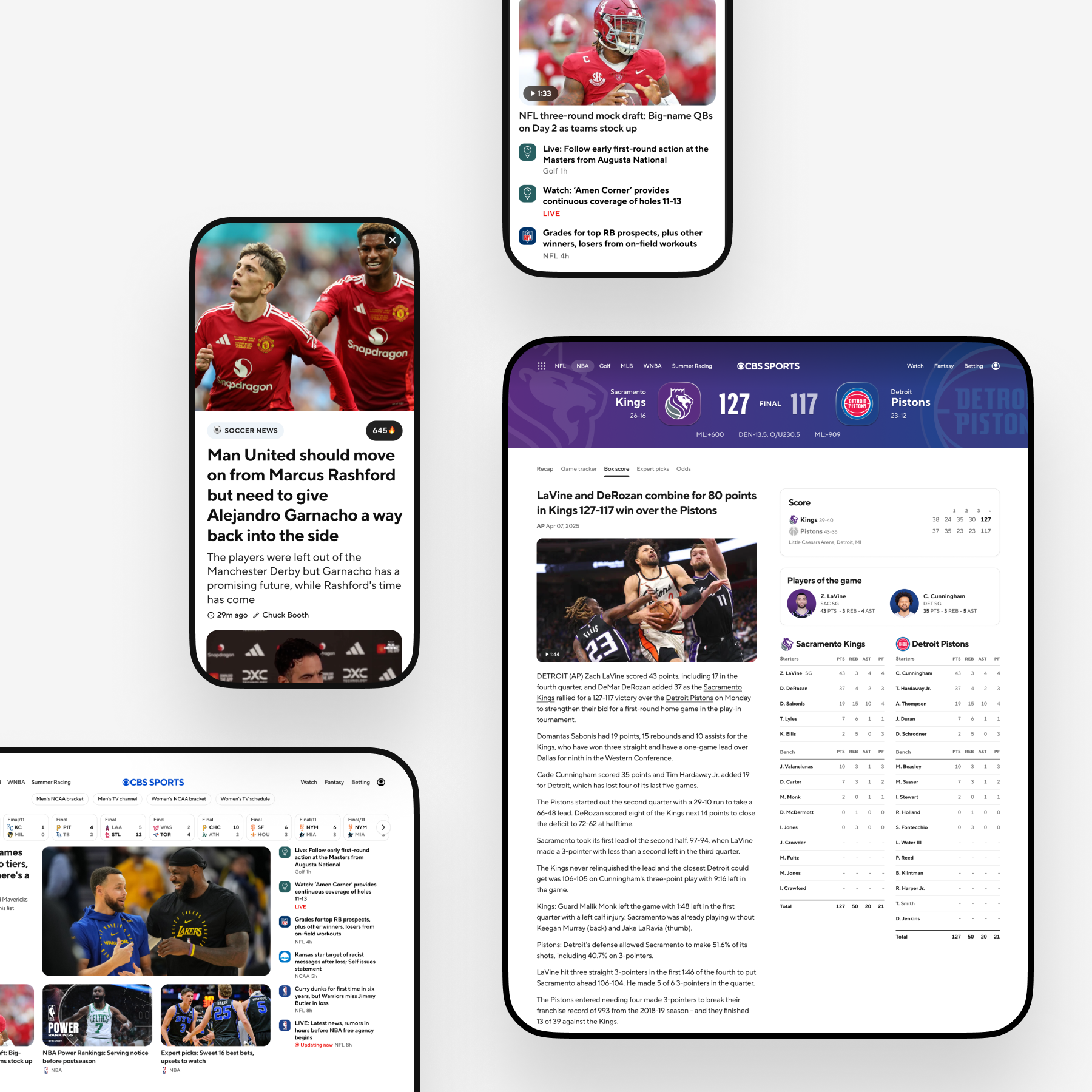
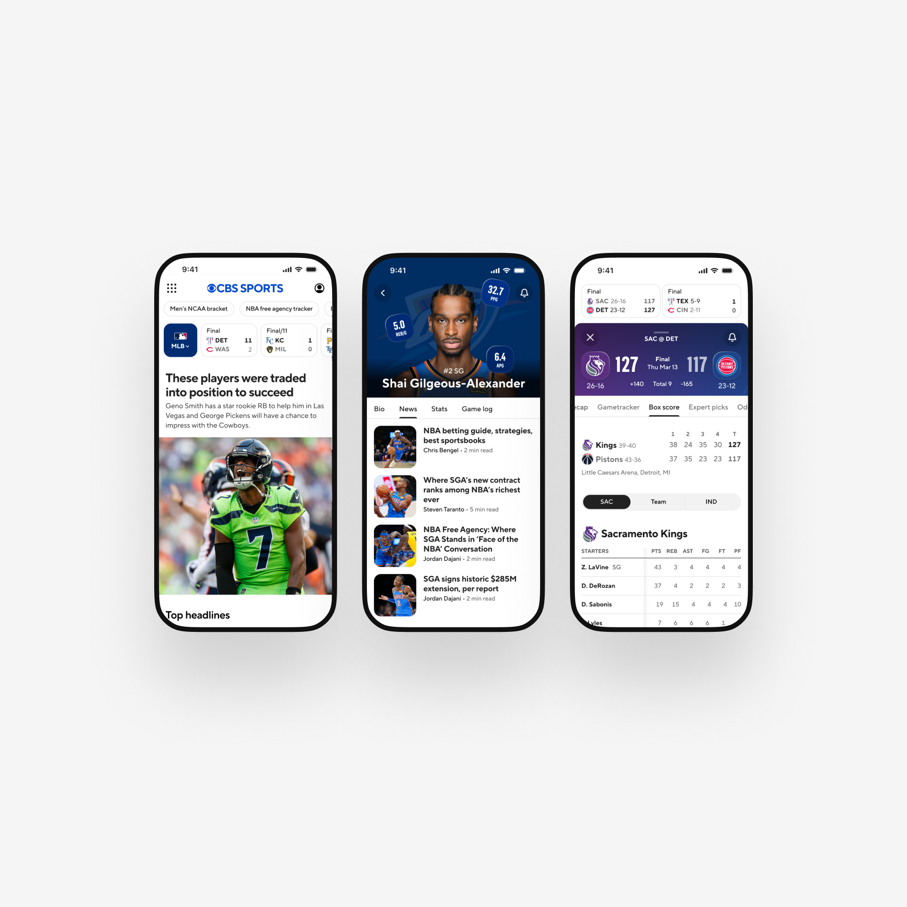
Once the foundations were stable in review, we applied Vanguard across the flagship Sports surfaces on mobile, web, and CTV to validate that each platform could inherit the rules without spinning up a parallel interaction stack. Every destination still required local nuance; the documentation specified how to keep behavior aligned regardless.
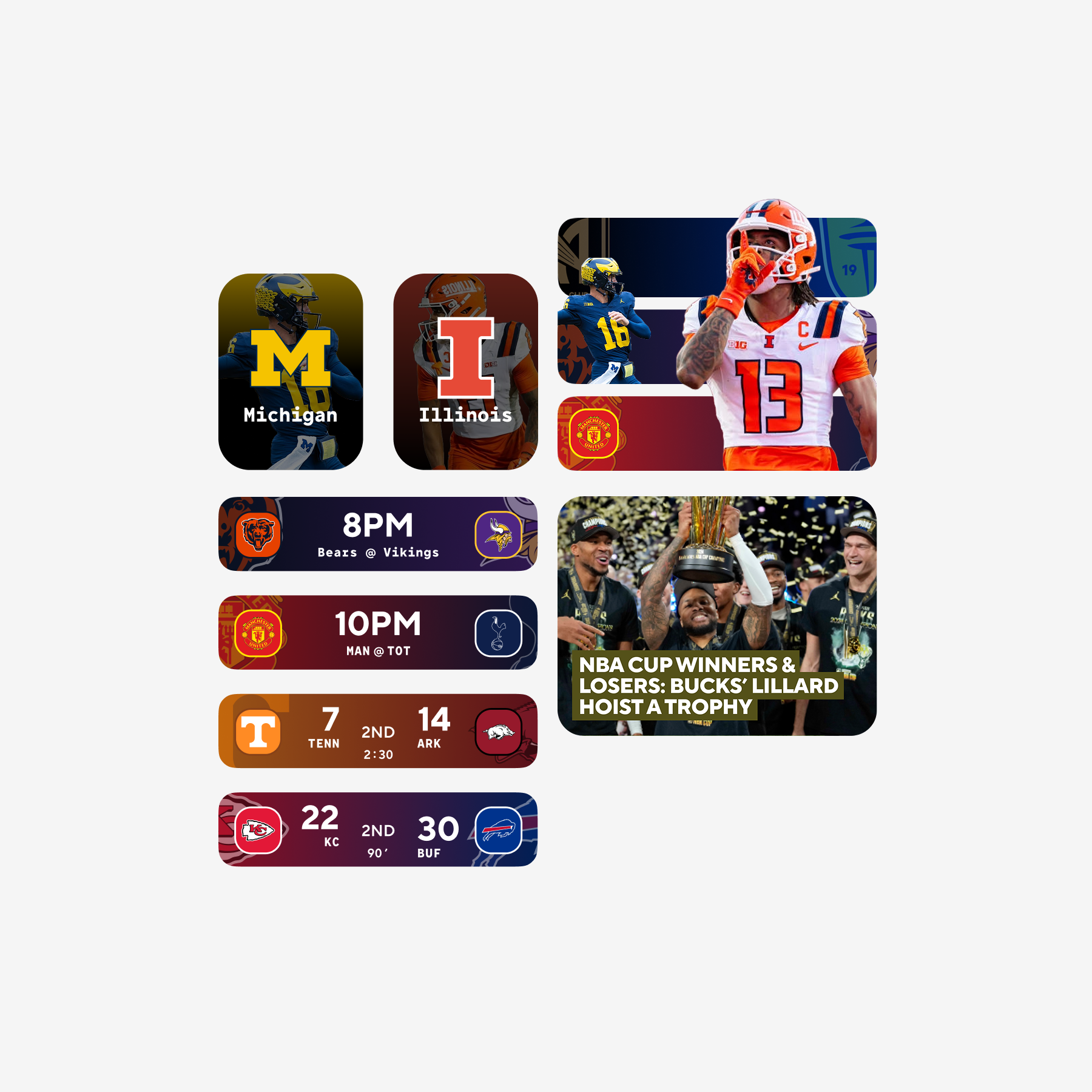
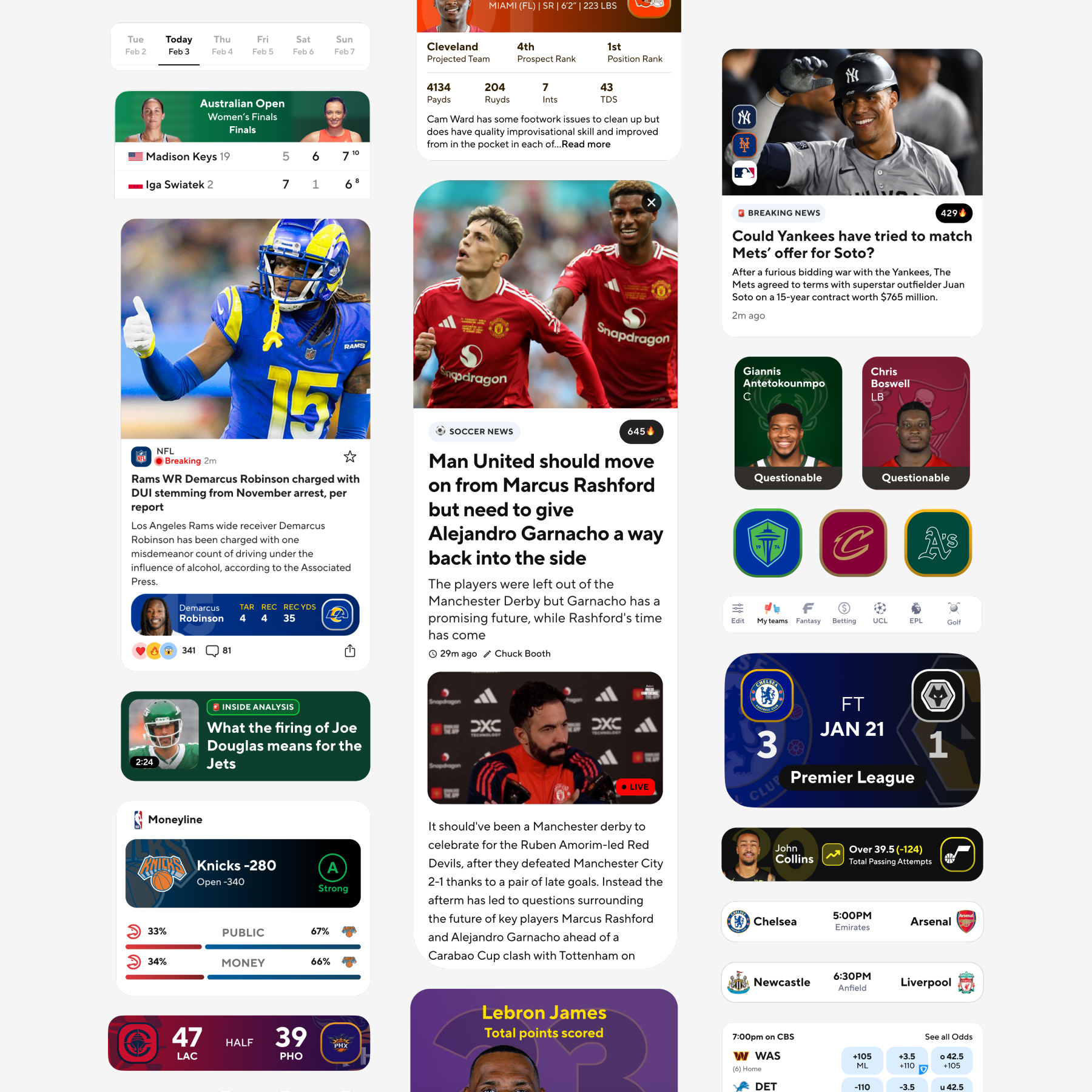
Small canvas, so prioritization matters: club color carries emotion, and live numbers need to register immediately.
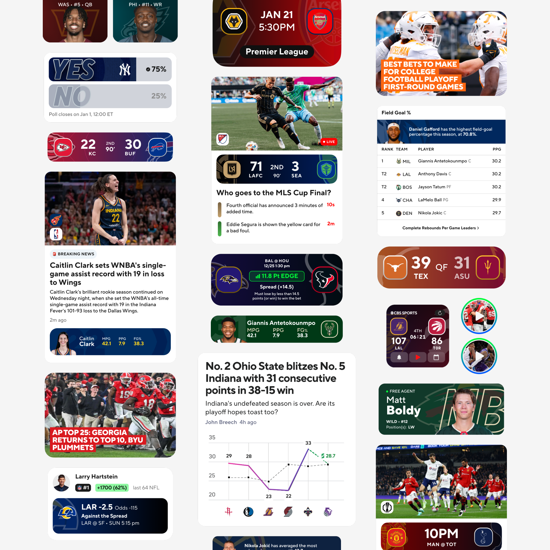
Wide canvas for boards and standings with the article template doing meaningful work alongside live modules.
Large type, generous spacing, motion tuned for distance. Score chrome had to read from across the room and still feel like broadcast.
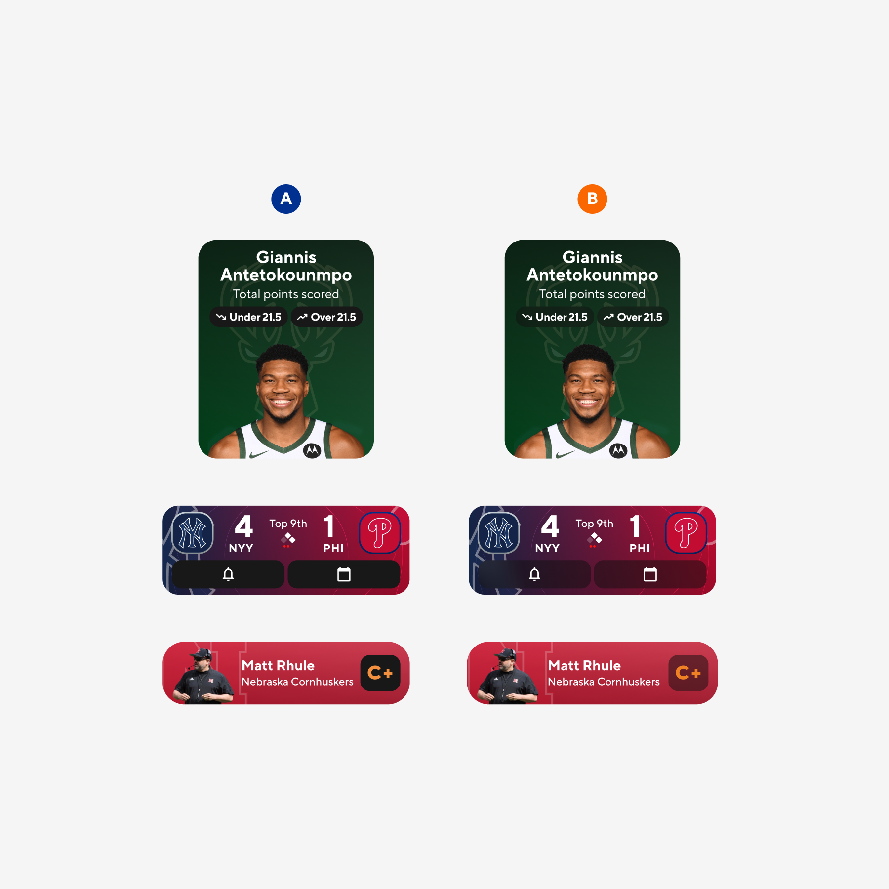
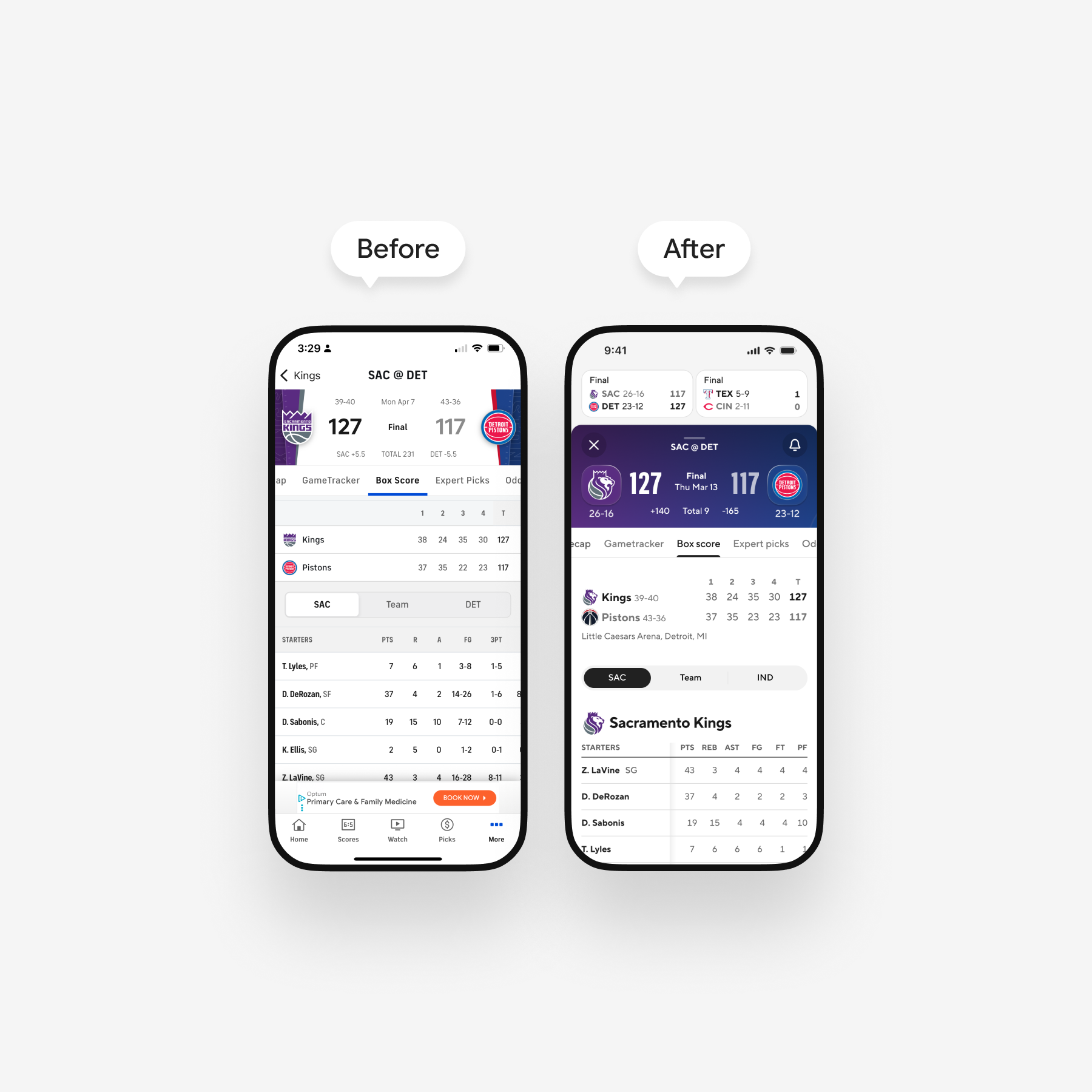
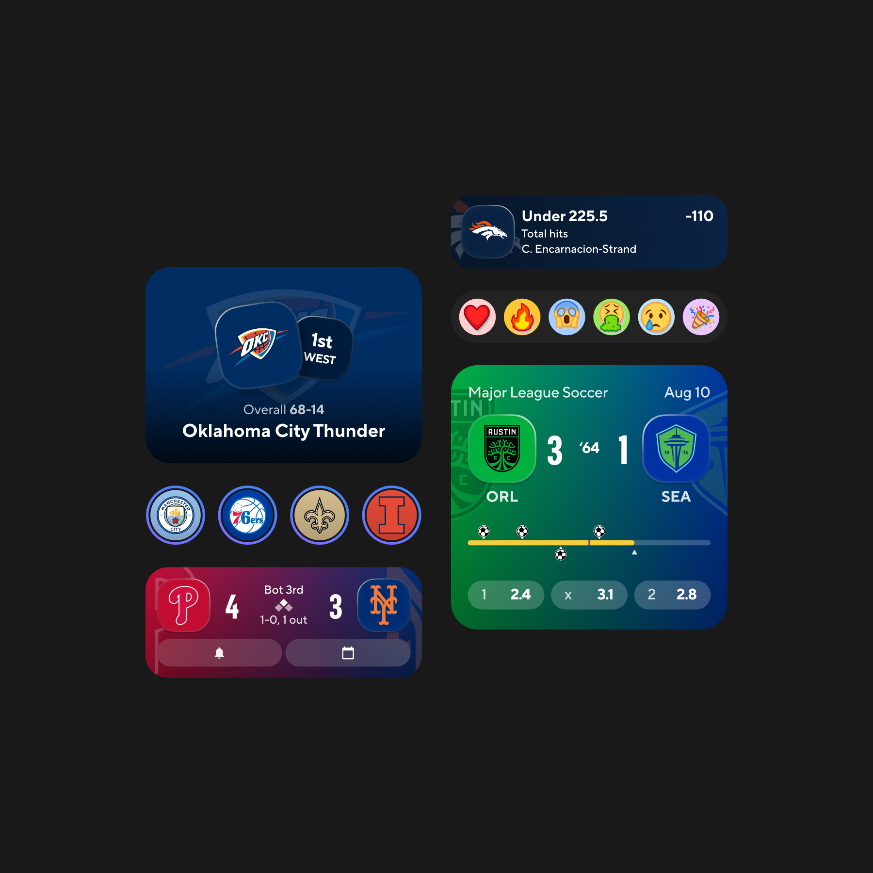
On mobile, I anchored the profile on the athlete: bold team washes, light dividers, and type that establishes name and role before users scroll into counting stats.
Score entry uses immersive headers and team-tinted backplates. Article rails incorporate subtle live cues from social feeds so the feed remains active between plays.
Whitespace and contrast carry the hierarchy so athletes, clubs, and the key numbers users care about surface first without additional chrome.
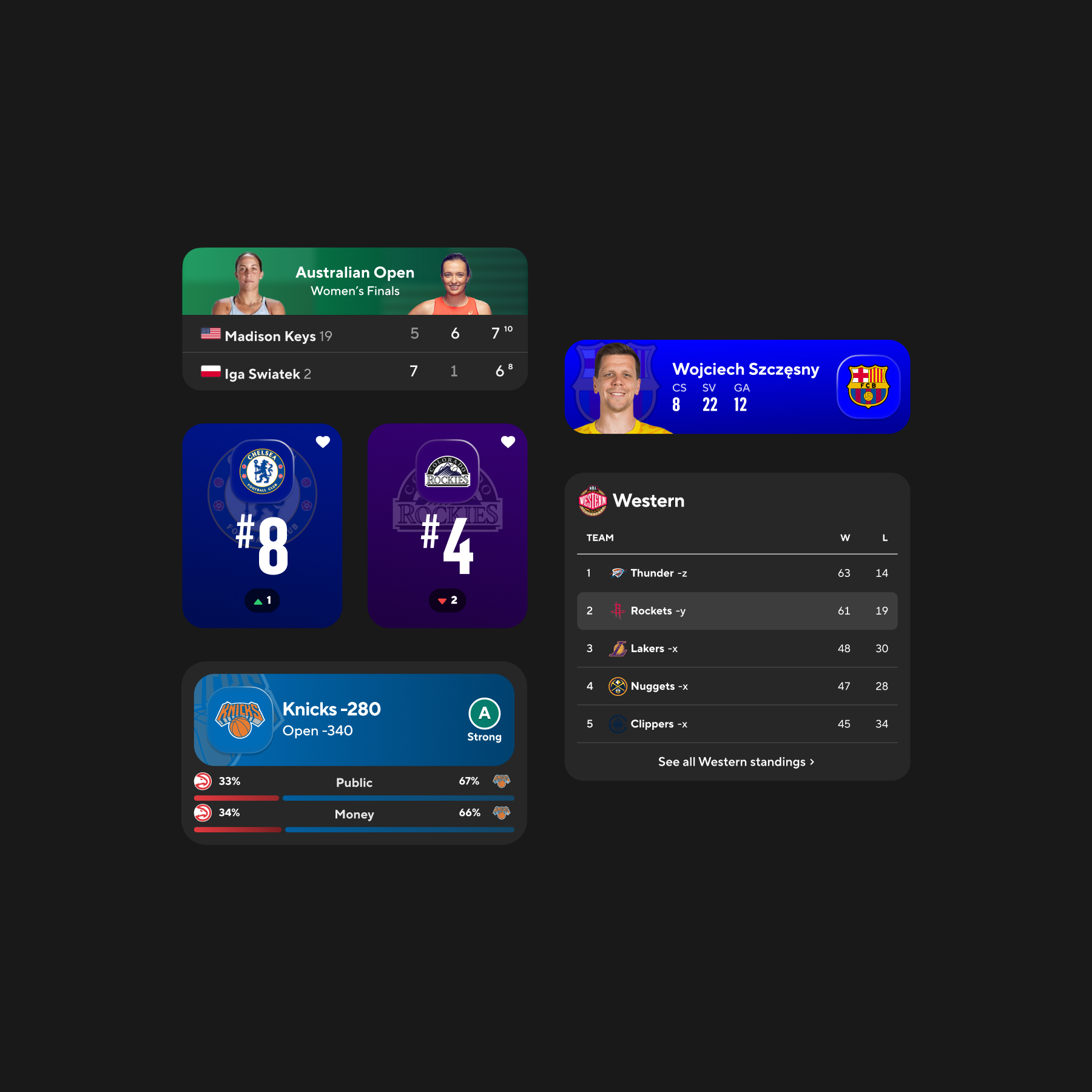
Older tracker states read like a bordered spreadsheet. The new pass leans on club color, spacing, and a HUD frame so momentum swings register more quickly.
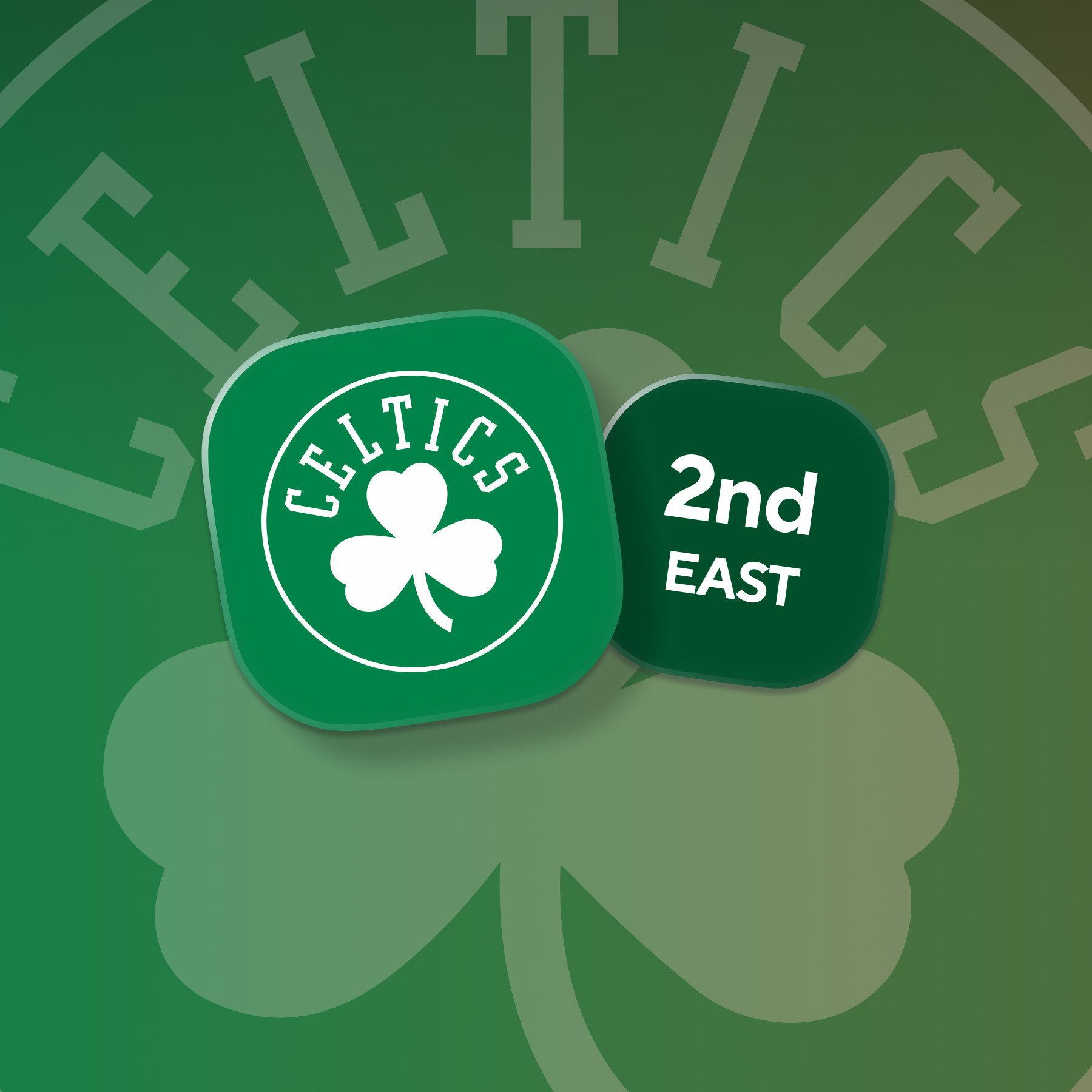
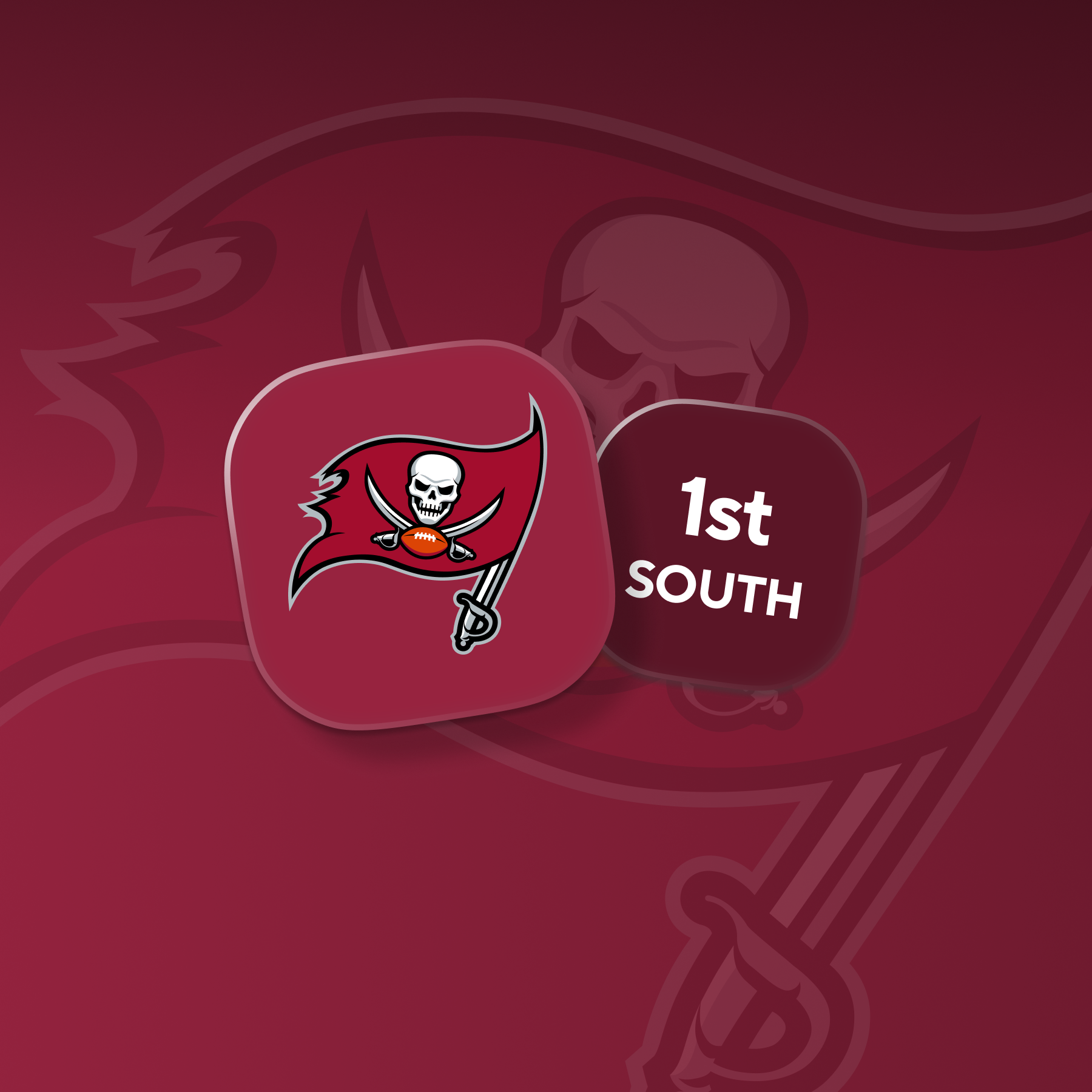
Crest studies explored color, depth, and tactility so badges read at thumbnail size while still holding up as hero marks.
Gradients and modeled badges convey the game's stakes before users scroll. The result should read closer to a poster than a utility header.
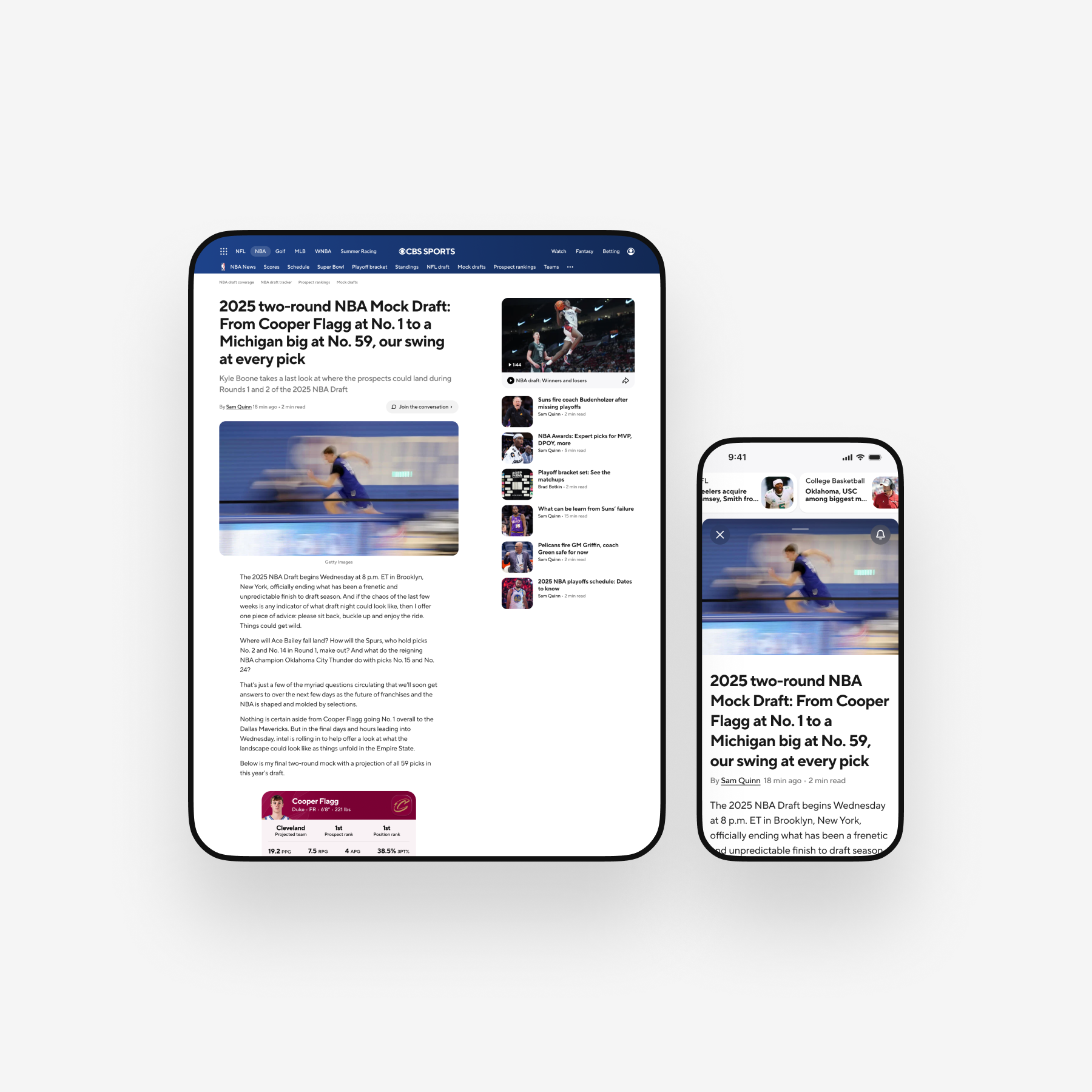
Full-bleed photography, tight copy rhythm, and a slide-up video well keep reading in flow. Users can open a clip without losing the article thread.
Club-tinted chips and callouts surface roster news and live swings. The refinement pass focused on when those elements are permitted to amplify.
Shared team color discipline and a common badge grammar help brackets and standings remain legible when users move between competitions across a weekend.
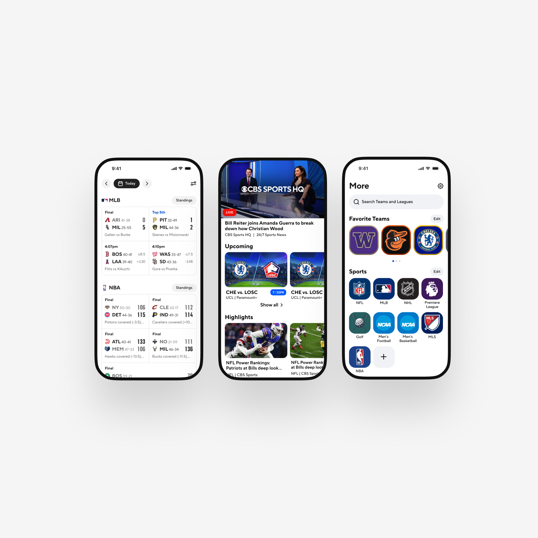
Home consolidates today's games, on-demand replays, and follows into one scannable stack so the content users care about surfaces early without additional taps.
Night treatment wasn't a late-stage repaint. Scores, stats, tables, betting nudges, and social replies share one component set with a documented dark skin, so contrast and club accents hold up under stadium lighting. Prime time is CBS Sports' default context, so we treated dim UI as a primary state rather than a special edition.
A focused pass on betting, soccer tracking, reminders, and reaction streams in dark mode to demonstrate how type, contrast, and club color hold up through the theme swap.
Vanguard ran for the better part of a year with design, engineering, and product leads in the same weekly cadence, and it remains one of the more substantial system efforts I've contributed to. It demonstrated that bold visual ideas can sit on shared logic rather than bespoke art files. The payoff I notice now is in meeting time: we replaced one-off comps with discussions about reuse, weighing what deserves a component versus a token adjustment versus genuinely new code.
Mobile, web, and CTV unified under one system of type, color, motion, and components, with documented per-surface interpretations.
Score, matchup, table, and article patterns consolidated into a shared library with default, live, dark, and personalized states ready for implementation.
Recurring pattern debates retired, replaced with shared component logic and motion guidelines that downstream teams can adopt rather than relitigate.