CBS Sports • 2022–Present
Scores-at-a-glance
Company
Role
Sr. Product Designer
Team
1 Product Manager
Skills
Design Systems
Product Design
Tools
Figma
Audit
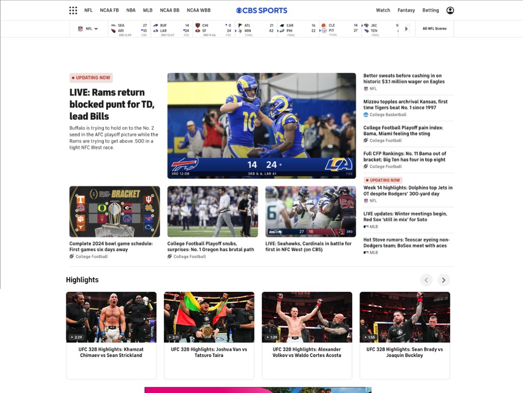
Auditing what the existing surface was missing
I evaluated the existing module across desktop and mobile, pairing qualitative review with quantitative data. Using tools like Axe and Lighthouse, I identified contrast failures, small hit areas, and missing keyboard navigation. Engagement data reinforced the findings, showing mobile drop-off and low tap-through rates, confirming that usability and clarity were limiting engagement.
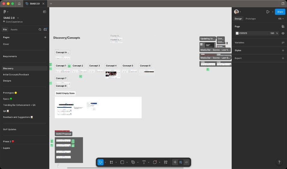
Exploration
Pressure-testing layouts before committing to high fidelity
I explored multiple layout approaches through sketches and low- to mid-fidelity wireframes in Figma. The focus was on improving information grouping, scanability, and spacing while maintaining flexibility across breakpoints. This phase helped define a structure that could support multiple sports without fragmenting the experience.

Refinement
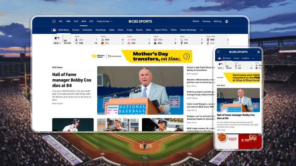
Cards rebuilt to flex across sports and game states
With the structure established, I moved into high-fidelity design. Cards were rebuilt with clearer hierarchy, improved typography, and spacing aligned to the CBS Sports design system. Visual treatments were refined to meet contrast requirements while maintaining brand consistency. Each card was designed to flex across sports and game states, ensuring consistency without sacrificing context.
Accessibility
Keyboard-first, always visible
Accessibility shaped the tile from the start rather than serving as a finishing pass. The clip below walks the tab path across the SAAG strip: focus moves in reading order, every interactive tile receives a visible focus ring, and the cue holds long enough to register clearly. The brief included several non-negotiables alongside that: tap targets sized for thumbs on mobile, contrast that holds up against team-tinted backplates, and a surface fully operable by keyboard alone for users who don't use a pointer. Full screen-reader narration was scoped to a follow-on iteration; this pass concentrated on strong keyboard semantics and visible focus across every state.
Impact
Where SAAG shows up, what it changes
Five measurements against the targets we set going in. They cover whether tiles get tapped, whether the strip reduces time-to-action, whether users bounce less, whether engagement balances across breakpoints, and whether the surface maintains a healthy quality bar in production.
15-25%
Lift in tap-through rate on individual tiles compared to the module SAAG replaced.
-10-15%
Reduction in time-to-interaction across the surface, measured against the prior baseline.
-10%
Reduction in bounce rate for sessions that landed on a SAAG-equipped page.
50/50
Engagement split between desktop and mobile, validating that the same tile component works across both contexts.
80+
Lighthouse score on production, holding the perf and accessibility bar through launch.
Build & launch
Staying on the thread from handoff through post-launch
I partnered closely with engineering through handoff and implementation to ensure design intent translated accurately into production. I stayed involved during development to review states, answer questions, and validate accessibility and responsiveness. Post-launch, I monitored early user behavior and shared insights with the broader product team.
Scaling out
How this scales
This project reflects how I add value beyond individual screens.
Surface focus
I identify high-traffic, underperforming surfaces and turn them into clearer, more engaging entry points.
Systems thinking
I design systems that scale across platforms, states, and use cases, reducing future redesign and engineering overhead.
Accessibility as a requirement
I treat accessibility as a product requirement, improving usability while lowering long-term risk.
Cross-functional partnership
I partner closely with product and engineering to balance user needs, technical constraints, and delivery timelines.
Outcome-driven
I focus on outcomes, using data and usability signals to guide decisions and measure impact.